 by Kelly Carey In honor of National Reading Month, 24 Carrot Writing is celebrating by sharing a few of our recent favorite reads. When social distancing and quarantine orders have us searching for home bound activities, books offer up friends, adventure, and escape. This might be the perfect time to open a book. Let me suggest a few fun places you can run away to without leaving your house! 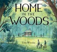 HOME IN THE WOODS uses gently lyrical language and stunning artwork to teach the stark realities of poverty during the Great Depression. It is a book about hope and persistence in the face of difficulty. Perhaps it can act as a road-map for how to move forward in the current environment. In picture books also look for Trevor by Jim Averbeck and illustrated by Amy Heveron, Hum & Swish by Matt Meyers, and What Miss Mitchell Saw by Hayley Barret and illustrated by Diana Sudyka. 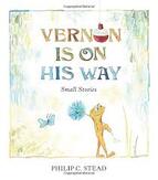 VERNON IS ON HIS WAY by Philip C. Stead offers the whimsical humor and soul filling simplicity of a silly frog exploring his surroundings and learning how to be a friend. Vernon is a celebration of everyday items and easy problems. Told in three short stories this book is a great mentor text if you’re ready to write a chapter book or if your young reader is ready to tackle a longer solo read. In chapter books also look for Frank & Bean by Jamie Michalak and illustrated by Bob Kolar. 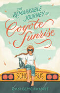 In THE REMARKABLE JOURNEY OF COYOTE SUNRISE by Dan Gemeinhart, Coyote and her dad Rodeo have suffered a BIG loss and Rodeo has decided the best way to heal is to travel forward on a converted school bus. As they encounter fellow travelers, Coyote starts to wonder if they really are healing and if maybe their aimless wandering needs a destination. You’ll be cheering for quirky Coyote Sunrise and her journey is truly remarkable! In middle grade books also look for The Benefits of Being an Octopus by Ann Braden and The Miscalculations of Lightning Girl by Stacy McAnulty. 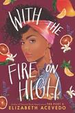 WITH THE FIRE ON HIGH by Elizabeth Acevedo offers plenty of spice in the form of main character Emoni Santiago who has a love for food and a knack for creating culinary excellence. But Emoni has lost her mother, her father is absent and she is navigating her senior year of high school while caring for her daughter. You’ll want to help Emoni, cry for Emoni and be Emoni – or at the very least eat her food! In young adult also look for The Book of Dust by Philip Pullman and Geek Girl by Holly Smale. Feel free to add your favorite fresh reads in the comments!
0 Comments
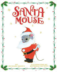
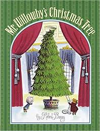
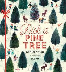
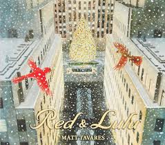
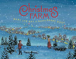
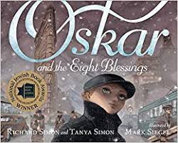
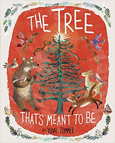
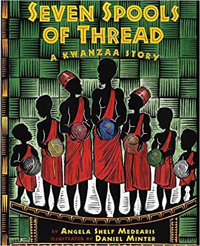
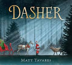
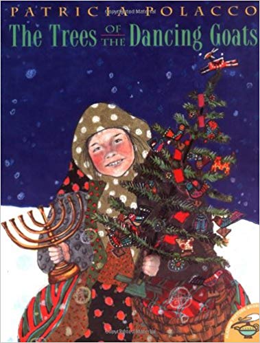
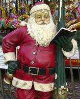 by Annie Cronin Romano The holiday season has arrived. When my children were young, one of our favorite activities to do was cuddling on the couch reading holiday picture books. Sometimes there were old favorites; other times they were the latest arrivals at our local library or bookshop. This post is a mix of holiday classics and newer arrivals to the shelves. Hopefully you'll find a few titles to add to your "must read" list (links are included with the cover images). Please share your favorite holiday picture books in the comments! SANTA MOUSE, by Michael Brown, illustrated by Edfrieda DeWitt MR. WILLOWBY'S CHRISTMAS TREE, by Robert E. Barry PICK A PINE TREE, by Patricia Toht, illustrated by Jarvis RED AND LULU, by Matt Tavares CHRISTMAS FARM, by Mary Lyn Ray, illustrated by Barry Root OSKAR AND THE EIGHT BLESSINGS, by Richard Simon & Tanya Simon, illustrated by Mark Siegel THE TREE THAT'S MEANT TO BE, by Yuval Zommer HANUKKAH BEAR, by Eric A Kimmel, illustrated by Mike Wohnoutka OLIVE, THE OTHER REINDEER, by J. Otto Seibold and Vivian Walsh SEVEN SPOOLS OF THREAD: A KWANZAA STORY, by Angela Shelf Medearis, illustrated by Daniel Minter DASHER, by Matt Tavares THE TREES OF THE DANCING GOATS, by Patricia Polacco Happy Holidays from all of us at 24 Carrot Writing!
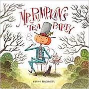
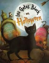
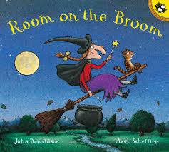
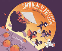
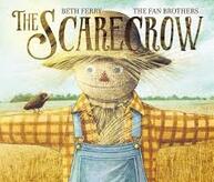
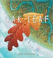
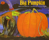
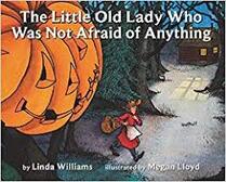
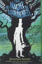
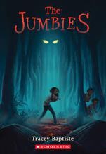
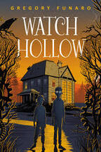
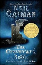
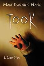
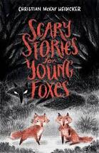
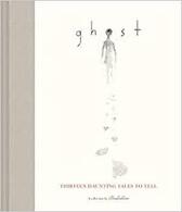
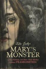
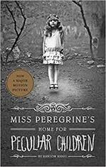
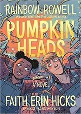
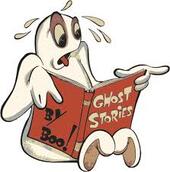 By Annie Cronin Romano October is well under way with leaves of amber and crimson, cool, crisp evenings, apple cider, winding corn mazes, and, of course, Halloween! Whether it’s carving pumpkins or choosing what costume to wear trick or treating, most families have traditions they enjoy throughout the fall season. As you embrace Halloween preparations, don’t forget to visit your library or bookstore to snag a few Halloween and seasonal books, and add some new favorite reads to your October rituals. This list contains just a sampling of the entertaining spooky and autumn-themed kidlit books to be discovered. Included are both older classics and newer releases. Most I have read and enjoyed myself. A few were suggested by other avid readers. Pick one or all of them, and dive into these stories of pumpkins, scarecrows, and things that go “Boo!” in the night! PICTURE BOOKS MR. PUMPKIN’S TEA PARTY by Erin Barker ROOM ON THE BROOM by Julia Donaldson, Illustrated by Axel Scheffler THE SCARECROW by Beth Ferry, Illustrated by the Fan Brothers LOS GATOS BLACK ON HALLOWEEN! by Marisa Montes, Illustrated by Yuyi Morales SAMURAI SCARECROW: A VERY NINJA HALLOWEEN by Rubin Pingk OAK LEAF by John Sandford BIG PUMPKIN by Erica Silverman, Illustrated by S.D. Schindler THE LITTLE OLD LADY WHO WAS NOT AFRAID OF ANYTHING by Linda Williams, illustrated by Megan Lloyd MIDDLE GRADE THE NIGHT GARDENER by Jonathan Auxier THE JUMBIES by Tracey Baptiste WATCH HOLLOW by Gregory Funaro THE GRAVEYARD BOOK by Neil Gaiman TOOK: A GHOST STORY by Mary Downing Hahn SCARY STORIES FOR YOUNG FOXES by Christian McKay Heidicker GHOST: THIRTEEN HAUNTING TALES TO TELL, a collection by Illustratus And a few YOUNG ADULT… MARY’S MONSTER: LOVE, MADNESS, AND HOW MARY SHELLEY CREATED FRANKENSTEIN by Lita Judge MISS PEREGRINE’S HOME FOR PECULIAR CHILDREN by Ransom Riggs PUMPKIN HEADS: A GRAPHIC NOVEL by Rainbow Rowell, Illustrated by Faith Erin Hicks Please share some of your favorite kidlit Halloween/fall season books in the comments.
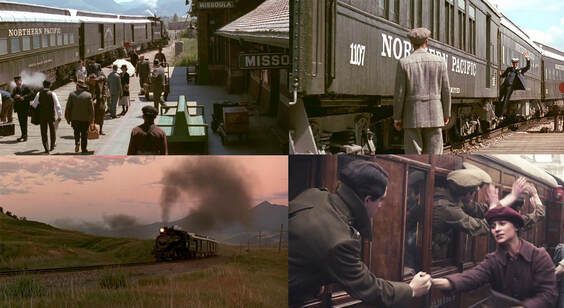
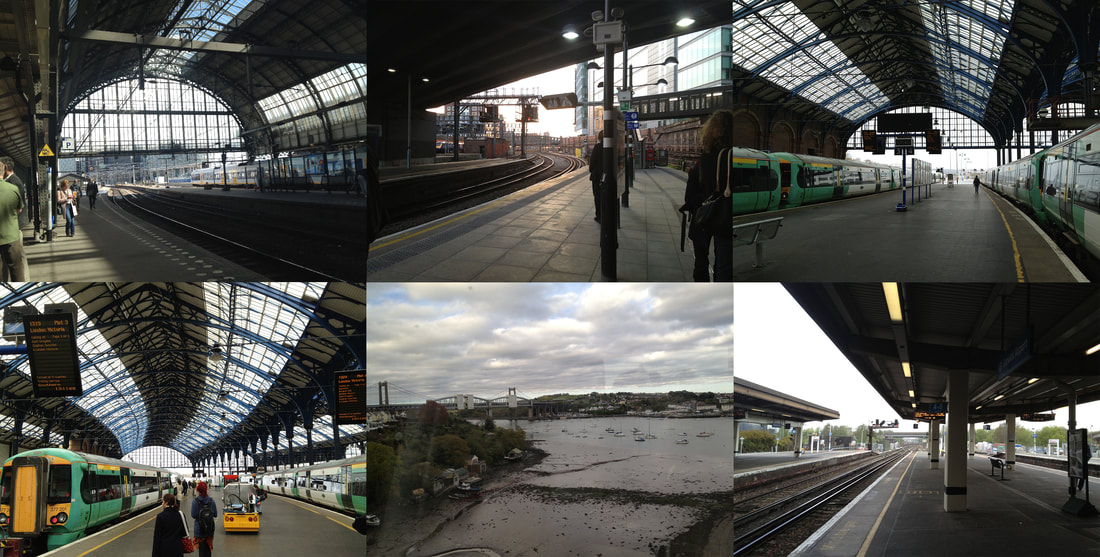
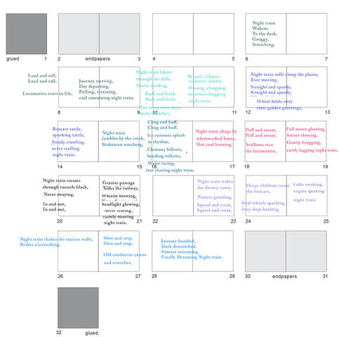
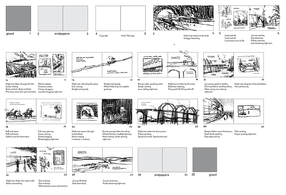
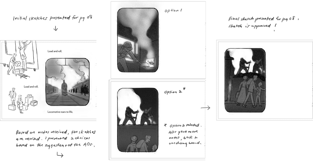
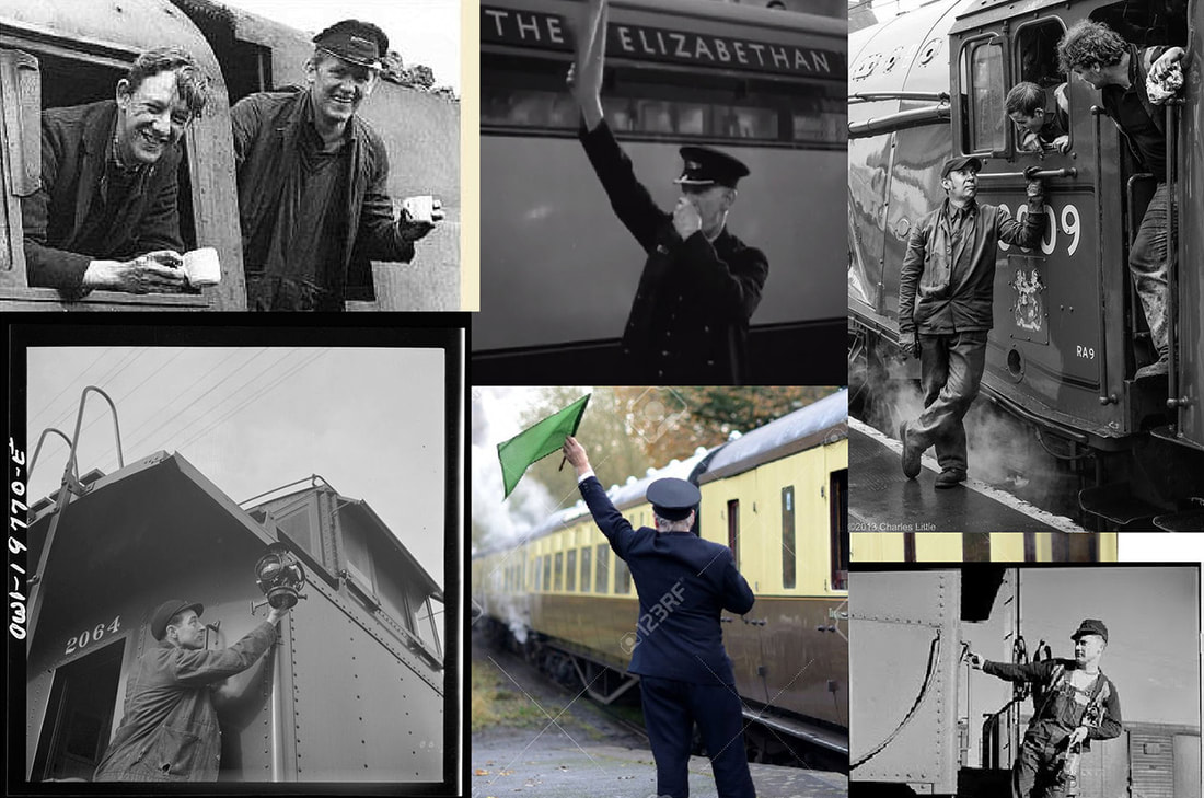
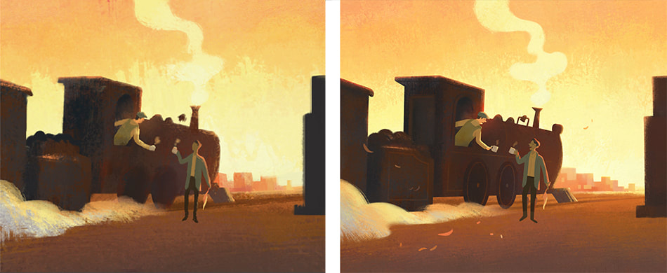
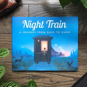
And HAPPY HALLOWEEN!  ~Guest blog by Angela Burke Kunkel When you think of a picture book being read, what--- or more precisely, who--- do you see? A child snug on the lap of a beloved parent or grandparent? A teacher, perched on the edge of a tiny classroom chair, reading aloud to a rapt class seated criss-cross-applesauce on the rug? A toddler, alone in their room during quiet time, studiously turning the pages and reciting a favorite book from memory? Or is the audience . . . you? Sometimes, in our journey to become writers, we study so much advice and so many mentor texts and blog posts and craft books that we lose sight of our own voice, our own relationship with books, our own relationship with words. We write for children, after all, many of us in a particular genre or format. Picture books present their own unique set of challenges, with the industry standard of 32 pages and that ever-fluctuating “sweet spot” for word count. And, of course, you have other considerations: room for the illustrator. The child. The reader. It can be enough to crowd out why you’re doing this in the first place. And, selfishly, it is okay if that’s you. Allow me to back up for a moment: In my daily professional life, I work as a teacher-librarian in a school that serves grades seven through twelve. My entire career, I’ve only worked with tweens and teens--- never with elementary or preschool-aged children (and, may I just say, bless those early childhood and elementary educators). When social conversations wind their way round to writing, teens and even other adults often express surprise that I don’t write YA. After all, that’s who I interact with on a daily basis. And there is incredible work for young adults out there. I love reading it and talking about it, especially with young people. But it isn’t what my brain reaches for right now, emotionally or structurally, in terms of my own writing. As someone who wanted to write novels for a very long time--- and never, ever finished a complete draft--- I found myself circling back to picture books. As I rediscovered them through my own young children, and through using them in classroom instruction with middle and high schoolers, I realized I also enjoyed them for my own aesthetic reasons. I loved how wordless titles felt like a silent movie unfolding. I loved the deceptive simplicity of clever refrains or circular structures. I loved the lyrical language and pacing of others, as metaphorical and gorgeous as any Mary Oliver poem. And yes, I’d read them with a child snuggled on my lap, or to a classroom of students (albeit at tables, not criss-cross-applesauce), but the aesthetic experience was a personal response for me. And eventually, I found myself reading them . . . by myself. When I had the itch to write after many years away from it, I allowed myself to consider the possibility of picture books. As Ann Whitford Paul notes in Writing Picture Books, picture book form is unique because they are books written for people who cannot yet read, “usually read by an adult reader to a nonreader . . . The pictures are there to entice the nonreader to listen and also help construct meaning from the words.” And she’s right, but I also think as writers we can expand our vision beyond that, while still respecting it. After all, aren’t all good stories, regardless of form, about the experience of constructing meaning? While it’s important to write with your primary audience in mind, remember that you can also have multiple audiences. I’d encourage aspiring writers to not only focus on how children might experience their book, but teens and adults as well. There are so many books I have used or want to use at the high school level--- from Faith Ringgold’s Tar Beach to Yuyi Morales’s Dreamers. Seeing teens, often stereotyped as cynical or disaffected, engaged in a picture book with the same wide-eyed wonder as a kindergartener reminds me that these stories serve a purpose for everyone. We just need to allow for that possibility. So my challenge to you is this--- when you’re writing, and especially during those free writes and first drafts--- allow yourself to let go of that image of the lapsit reader or the elementary classroom. Disregard that editor voice in your brain that questions things like appropriateness and marketability and Lexile level. And, just for a little while, allow yourself to play. Swim around in words that make you feel like you’re engaging in a beautiful piece of language that isn’t cataloged “E” because it’s Easy. It’s “E” because it’s for everyone. And maybe, in that space of openness and play, you just might surprise yourself (and ultimately, your reader) with something beautiful. Bio: Angela Burke Kunkel's debut picture book, DIGGING FOR WORDS: JOSÉ ALBERTO GUTIÉRREZ AND THE LIBRARY HE BUILT (illustrated by Paola Escobar and published by Random House/Schwartz & Wade) releases in Fall 2020. In addition to being an author, Angela works full time as a school librarian. She is a graduate of Simmons College in Boston, Massachusetts. Angela is represented by Liza Fleissig at the Liza Royce Agency. You can contact her here. You can also connect on Twitter and Instagram.  Guest blog by Ileana Soon Hello! My name is Ileana, and I am the illustrator behind Annie Cronin Romano's book, Night Train: A Journey From Dusk to Dawn. I was invited by 24 Carrot Writing to contribute some of my thoughts and share my experience bringing Night Train to life. There were a lot of things I learnt along the way. I'll touch on my process here as well as walk you through some of my thoughts behind my visual decisions. This will be fun! Getting the manuscript, thoughts and ideas I was really excited when I got the manuscript as I had felt like the story was right up my alley. It had travel, a train journey, and a great sense of adventure. Whilst reading the script, the feelings it evoked popped a few visual references into my mind, such as the movie A River Runs Through It (directed by Robert Redford) as it seemed to capture the same feeling. Seeing as it was a period setting, other visual references soon followed that were also period pieces; movies like Testament of Youth (directed by James Kent) and The Painted Veil (directed by John Curran). Below are some screenshots taken from the movies mentioned. As an illustrator, I think it is important to always bring something personal to every project worked on, the theory being that sharing a personal experience through art will somehow invite an emotional connection from the viewer, even if it's something that can't quite be explained. I find that throughout my life I have been attracted to paintings only to find that it, too, was very personal to the artist. Reading Annie's script brought back a lot of my memories travelling as a student throughout Europe and the UK. To save on accommodations, there were many nights spent at train stations and on trains, enroute to the next destination. It was the perfect experience to borrow from as I remember some nights staring out the window from my train, and watching the sun rise as the train moved into a new station and country the following morning. It was exhilarating. Below are some pictures taken during my travels that served as reference. To begin, it was important to lay out the pacing of the text. What would be the rhythm of this book? Using Photoshop, the words were cut and pasted onto each page until the pacing felt right. Next, I wanted to come up with a visual vocabulary for this world. As you may now realise, cinema is something I really love, and borrowing from this, the art direction for this world could be set in screen direction, and colour. Visually, it's a challenging task to illustrate a train making a journey through the night. If you think about it, how many truly different ways are there to paint a night sky? How many night skies can there be in a book without boring the reader? (Surely not 32 pages!) To vary and make it visually interesting, I wanted to bring variation to this journey through colour temperature as you can see in the swatches below. I will also touch more on colour later. Screen direction (or page direction in this case) seemed important to show continuity in the train's journey from dusk to dawn. It's vocabulary that some films use to show progress for a character throughout a plot. It's a subtle thing, but throughout the book the train always moves from the left of the page to the right. Every single page. Included below is this thought laid out in a page sent to the publisher. Let's draw! So to recap, here is a summation for the visual vocabulary of Night Train. Inspired by the aforementioned films, the story was set in the 1920/30s. Inspired by my travels in Europe and the UK and a train journey that I took from a big city to a small town by the sea in the UK, I thought mapping a similar route would help to capture the same sense of wonder in these illustrations I felt on that journey. The colours would change from warm in the beginning to cool by the end. The screen direction for the train would always move from left to right. Annie also shared her thoughts of how it would be great to set the train journey in the Pacific Northwest. Great! More specificity — always a good thing. Ideations, thumbnails, sketches and revisions Since pacing is very important, it was important for me to ideate the entire book in one go, instead of focusing on a page at a time. This meant jotting (drawing) ideas out on posits whilst laying out the entire book. This is all done by hand, sticking post-its to a wall. This was a habit my director and I used to do, whilst previously working at an agency as a lead designer, doing different storybeats for commercials and laying it all out in sequence on a glass window. Below are the rough notes ideating for Night Train in sequence. Please forgive the roughness of this; this is not something I would ever show to anyone and it's done for my reference only when beginning a project. They are just thoughts. Doing this provides an opportunity to see the story as a whole and choose compositions that work sequentially to match the pacing in relation to each other, rather than picking the best composition for every page, which would make the book tonally flat (imagine a loud note for every page — not fun to listen to surely). I sometimes imagine sequential images as a song: the notes (images) have to flow together nicely, the volume (light vs dark) has to modulate as well, and all in one key! That's where visual vocabulary comes in. From these thoughts, images are chosen to put together thumbnails to deliver to the publisher: After the thumbnails are delivered, the team at Page Street gave me a green light to move toward sketches. Sketches are refined drawings from the thumbnails presented. From these sketches, my Artistic Directors give feedback, and these sketches go back to the drawing board until they are approved. The team at Page Street had the fine idea of introducing a family as characters that we could follow throughout the book, instead of the separate individuals I had previously sketched out. Great idea! Some sketches are approved straight away, but some go through several iterations. Included herein is a sample of the evolution of a sketch from presentation to approval: Colour Script After all the sketches were approved, I was asked to bring a spread to finish, and somehow in the back and forth with the team at Page Street, I proposed the idea of doing a colour script so they could see at a glance how to book would look like as a whole. Included herein is the colour script that was sent to Page Street: Challenges with colour One of the great challenges of this project was to find a way to have words sit on a page against the night sky whilst still being legible. Blue, or black for that matter, is dark in value, and black words against a dark blue sky is very hard to read. The publisher specified at some point that most of the type printed would be black, so on my end I felt it was important to structure the pages so that the words could be read against the painted backgrounds. Additionally, there was also the extra challenge as previously mentioned to make the pages more exciting, as 32 pages of purely dark blue skies would make the book tonally flat. Thus, if you notice, less than 50% of the book (about 41%) is actually set against a dark blue sky, whilst the rest is set against the backdrop of the sun setting, and the sun rising, which gives a lot of opportunity for the black type to sit against lighter backgrounds, making it more legible. This opportunity also opened up a pocket of time in terms of the hours that the train started and ended its journey. If its journey started at say 5pm, and ended at say 7am, the different variations of light that it would see during its journey would naturally vary a lot, bringing with it many exciting ways to introduce changes in colour temperatures as the pages turned. Sticking to the visual vocabulary of moving generally from a warm palette to a cool palette from beginning to end, the frames have been aligned in sequence here so it may be easier to see what my thought process was like in doing this colour script. Race to the finish After the colour script was approved, everything from there on out was very straightforward. It was really a matter of just refining the pages from the colour scripts to a bigger final, finessing the final details, and adjusting colours as needed. Since it was set in a very specific time period, and also in a very specific geographic region, it really is important to make sure that all the references were right, from the costumes to the shapes of trees and smaller details surrounding all the pages. Below are some costume references sourced from that time period. These references were sourced from books at the library, archived film footage, as well as Pinterest. The final few weeks working on this really did feel like a race to the finish! Below is an example of the evolution of a page from the colour script to the final. The End Delivering the pages to my AD was a great feeling, and she has to be thanked for really being there at every step of this journey with me. I sincerely believe that all the feedback given made the pages better, and the visual ideas stronger. Hopefully, this translates over to the reader when they pick up this book. Final thoughts
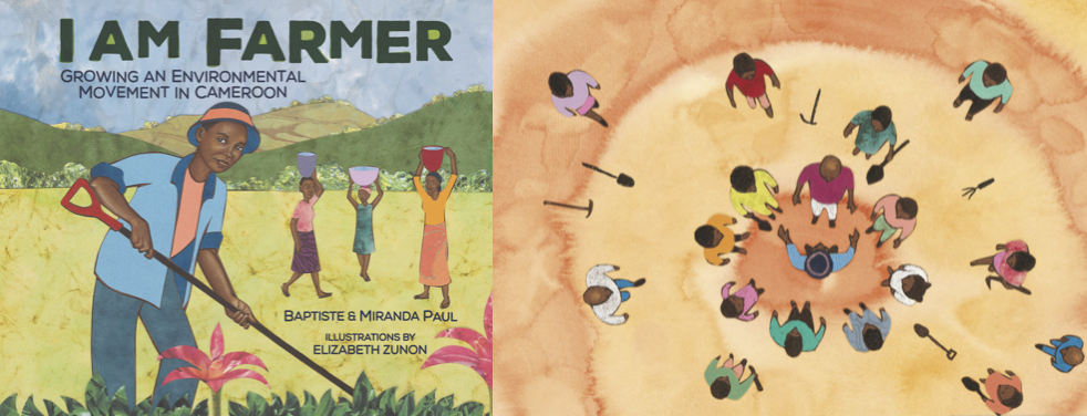
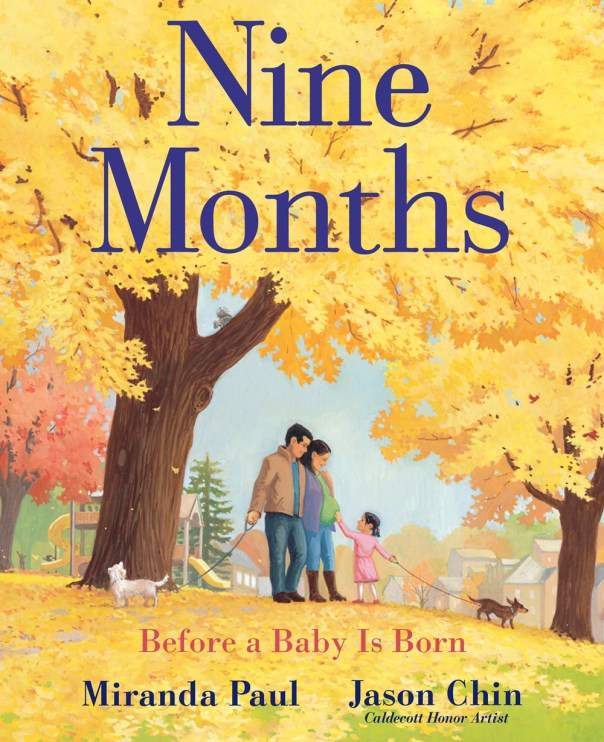
Thank you for letting me share my process of bringing Night Train to life with you, and thank you to 24 Carrot Writing for inviting me to do so. I hope it was helpful and am looking forward to reading all the different approaches/processes other illustrators have here in the future. About the Illustrator Ileana Soon is an illustrator/vis dev artist who grew up in a small seaside town in Borneo, before making her way to Los Angeles where she currently lives and works. Her clients include The Wall Street Journal, The New York Times and Oprah Magazine. She has also won multiple awards, including a Silver Medal from 3x3, as well as recognition from American Illustration and The World Illustration Awards. Learn more about Ileana and see more of her work at http://ileanasoon.com/, on Instagram at https://www.instagram.com/ileanadraws/, and on Behance at https://www.behance.net/ileanasoon. 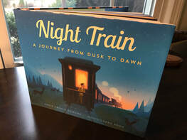 by Annie Cronin Romano A few weeks ago, I arrived at a storytime and book signing for my recent picture book, Night Train: A Journey from Dusk to Dawn. I was greeted by one of the booksellers, who informed me they’d been getting sparse attendance at their Saturday kids’ events. I told her not to worry as I realized these types of events were hit or miss. A few minutes passed and, apart from a fellow writer and her friend, no others had arrived. A woman who’d been lingering nearby approached and asked if I was the author doing the event. She said her two teenage sons—a senior and junior in high school—needed to attend an author event for their AP Literature class so she’d brought them to my signing, not realizing that I wrote for children and would be reading a picture book that morning. “Where are they?” I asked. “Upstairs. They don’t want to come down.” I laughed and told her I understood. Personally, I was relieved because at this point, with just a couple minutes until my reading was to begin, zero children had arrived. Nada. This gave me an audience, though not the demographic I’d been expecting. I told her, “Have them come down. I’ll talk to them about my writing process and answer their questions. And I won’t make them sit and listen to me read.” The young men arrived—with hesitation—and I introduced myself and told them a little about my writing. I was about to ask if they had any questions when their mom said, “Really, I’d like you to read your book. That’s why you’re here.” My writing friend wanted to hear me read as well, so I asked the boys to humor me, filled them in on the inspiration for the story, then read. When I finished, the tone shifted as the two teenagers started asking me questions. One after another. First about the story itself. Then about the writing process. Then about publication. We discussed writing in rhyme versus prose, the editing process, and how picture book writing differs from novel writing and the unique challenges it presents. The dialogue was amazing, and the experience of seeing these young men realize that picture books are not babyish as they’d thought was one I will never forget. They realized the significant work that goes into constructing a children’s story, even one just a few hundred words in length, and they seemed to understand that the age of your target audience does not define the level of effort needed to create quality writing. A few minutes later, some little ones arrived and asked to participate in the storytime and craft. I said goodbye to the teenagers and turned my attention to what had been my intended audience. But my heart was already singing at the fact that those teenage boys had come downstairs to the children’s room reluctantly and returned upstairs with a newfound appreciation for what goes into writing for children. A very good--and unexpected--storytime, indeed.  ~by Amanda Smith I have been following Miranda Paul's career for many years and celebrate along with her as her fifteenth book will be released this year. Her picture books inspire young readers to take care of the earth and one another. She invests generously in the kidlit community as founder of RATE YOUR STORY and co-founder of WE NEED DIVERSE BOOKS. Her generosity also spills over in other walks of life in local and international communities, where she invites others to come alongside her and spark change. I am honored to welcome Miranda to 24 Carrot Writing to tell us about her newest book-baby. NINE MONTHS: Before a Baby is Born (illustrated by Jason Chin) released on April 23, 2019. You have said of this book, “My heart is full to have this very special book received with love. It's been in development for ten years, and I may cry upon its ‘birth.’” Please share with our readers the journey of NINE MONTHS and why it is so close to your heart. Nine Months is the book I wanted when I was pregnant with my second child. Sometimes that’s why you write a book—the one you want doesn’t exist yet. While every day I was getting access to weekly updates on the status of my baby, where was the scientifically-accurate yet age-appropriate book for my two-year-old daughter who was as curious as I was about each stage of her new sibling’s development? And while there were plenty of great picture books about where babies come from or emotional picture books about how much love a new baby gets, I struggled to find one that struck the right balance between the two. It only took ten years, but Nine Months is exactly the book I wanted. The science of human life is as miraculous as the love families have for each other. This book compromises neither one, and it’s also a reflection of the diversity of our world’s families. Your books are diverse in theme, yet many deal with social/environmental issues. Why do you gravitate towards telling these kinds of stories? Diversity and environmentalism are important aspects of my life, and my work is an extension of who I am and what I believe. As a white woman, I am keenly aware of my privilege and how representation in society can elevate or diminish someone’s opportunities. On a more personal level as a mom, raising biracial, multi-ethnic children who are also nature lovers is my everyday joy and task. Having traveled, lived, and made friends with people in more than a dozen countries has afforded me the discovery that human beings are more alike than we are different, and that our planet is a superbly beautiful place worth protecting. All children need to be reflected in and honored by the stories we tell, and our planet should be given a voice. 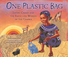 You are such a prolific writer, and you do school visits and many other public appearances as well. How do you structure your writing time? Do you write on specific days or do you write every day? I get this question a lot. Many people don’t know that I’ve been writing most of my life, so when I began in children’s books I had a body of work and experience writing for other kinds of publications. My structure isn’t exactly the same day-to-day (what working mother can say this? What person, for that matter?). But just as any other self-employed person I set schedules and have honed my self-discipline. I do most of my school visits in spring and fall, and therefore a lot of new writing and researching naturally falls in the winter and summer months. There’s no magic equation. Everyone who is an aspiring writer—even if you’re working another job (like I was when I began) or taking care of children or elderly—must find the motivation and momentum to fit the work into the “cracks of life,” to use a phrase I heard from writer Susan Manzke. You may not have entire days to write, but you might have snippets here and there. Enough snippets put together make a book. Here at 24 Carrot Writing we are big on setting goals as a way to stay motivated and on task. Do you use writing goals to keep focused? Would you mind sharing your goals or 2019? Just before my debut book One Plastic Bag released, I had a moment in which I knew I was exactly where I needed to be. The feeling was exhilarating; it’s hard to describe. So for the past couple of years, my goals have leaned toward enjoying the process and keeping on the same path. Of course, I also have personal goals for growth and pushing myself to try new things. Not all of them have to do with writing, which is what I find most meaningful. The more I work on having the life I want, the better I seem to be doing professionally. I get to write—and live—what I believe. Keeping that realness is at the top of my list of goals, because I hope it’s an inspiration to my children that exploring who you are, staying active in areas that matter to you, and developing your passions are all measures of success, regardless of the outcome. What would you like to say to writers who are reading this interview and wondering if they can keep creating, if they are good enough, if their voices and visions matter enough to share? Remember that even though you may pour your heart into your work, ultimately you and your work are separated once it goes out into the world. A rejection or critique is about the words on the page—not you, personally. So yes, you can keep creating. Yes, you are good enough. And yes, your voices and visions matter enough to share. It’s really that simple. Thank you for sharing your heart and wisdom with 24 Carrot Writing, Miranda. New and Upcoming Books by Miranda Paul:Bio: Miranda Paul is the award-winning author of One Plastic Bag, Water is Water, and I Am Farmer, all Junior Library Guild selections. Whose Hands Are These? was named a 2017 ILA Teacher's Choice and Are We Pears Yet? won the 2018 Award of Excellence in Children and Young Adults Literature from the Council on Botanical and Horticultural Libraries. Her most recent release, Nine Months: Before a Baby is Born, received three starred reviews from Kirkus, Booklist, and Publisher’s Weekly. Miranda Paul is an annual faculty member at the Highlights Foundation and a co-founding member of the nonprofit organization We Need Diverse Books, for which she currently serves as Mentorship Chair. Visit her at mirandapaul.com. NINE MONTHS: Before a Baby is Born, as well as Miranda's other book are available at these retailers:
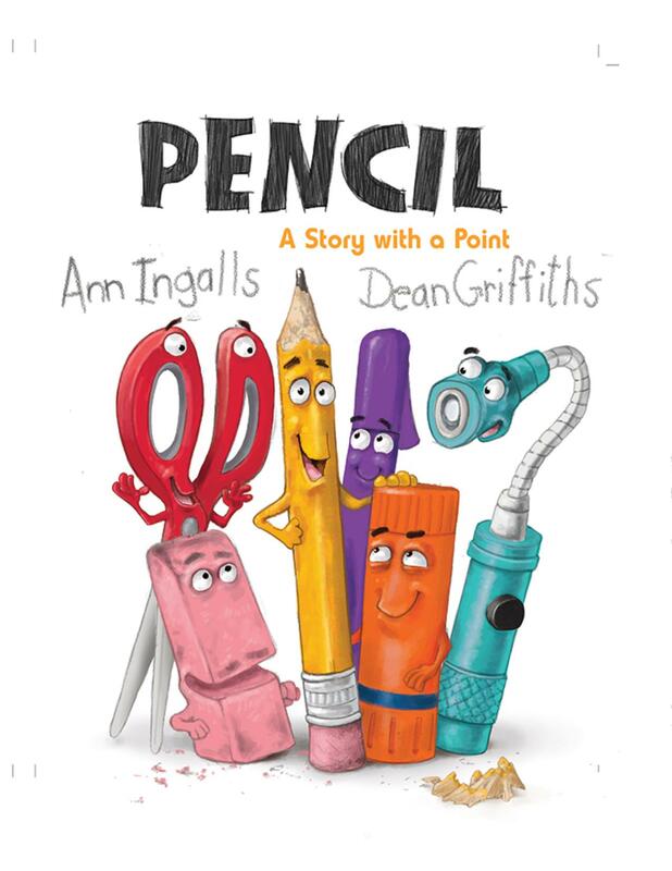
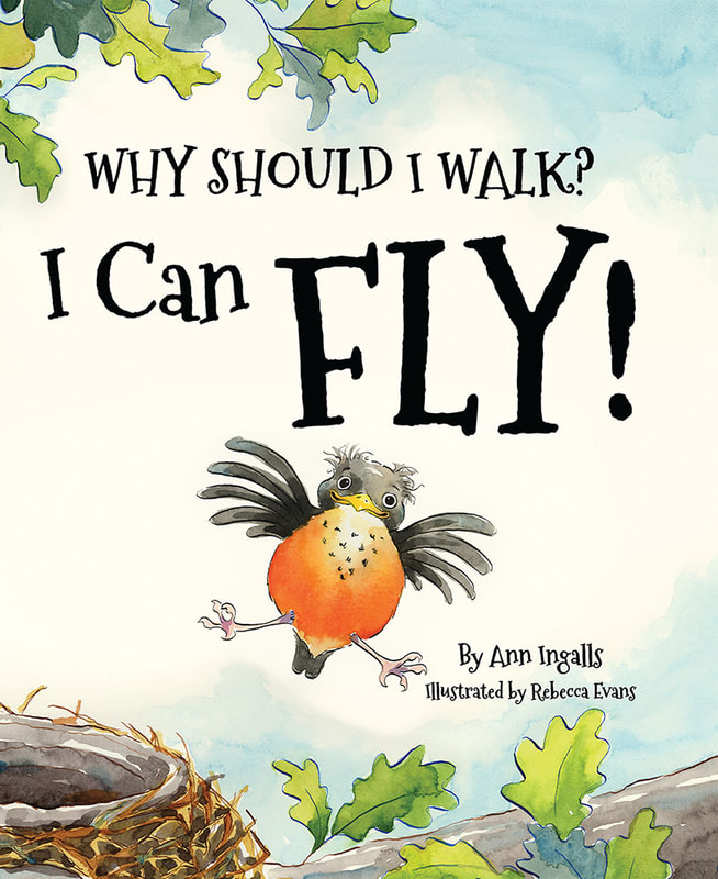
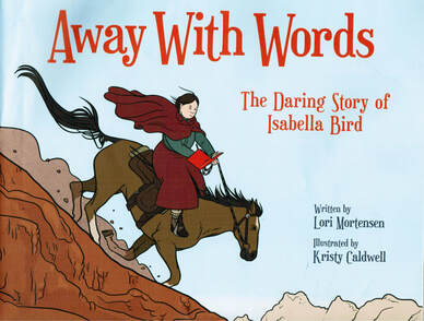
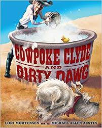
Indiebound: https://www.indiebound.org/book/9780823441617 Barnes and Noble:https://www.barnesandnoble.com/w/nine-months-miranda-paul/1129200776?ean=9780823441617#/ Amazon:https://www.amazon.com/Nine-Months-Before-Baby-Born/dp/082344161X/ref=sr_1_2?keywords=Nine+Months&qid=1556288387&s=gateway&sr=8-2 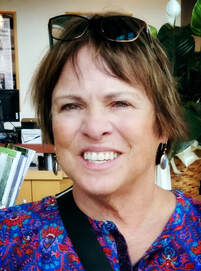 Interview by Annie Cronin Romano Welcome Ann! We are happy to have you join us to be interviewed by 24 Carrot Writing! How did you come to be a children’s book author? I have always loved to read and write. My father took me to the library every week as a child. He let each of his eight children check out three books a week. Imagine keeping track of that? I was late to learn to read--maybe the end of first grade. He read Madeline to me and I knew how important that book was. After all, my siblings and I walked in lines, just like Madeline. When you write, do you plot out your stories or are you more of a pantser? I suppose I’d describe myself as more of a pantser. I write one sentence telling what my book will be about. Then I dive into the research and build a word/phrase bank. I have had early drafts for picture book that run over 20,000 words. I peel away bit after bit until my story reveals itself to me. Not the most efficient practice, but it works for me. You have two recent releases: PENCIL: A STORY WITH A POINT (Pajama Press, 2/15/19) and WHY SHOULD I WALK? I CAN FLY! (Dawn Publications, 3/1/19). What was your inspiration for these stories? I was cleaning my kitchen junk drawer. I have several more throughout the house. Maybe more than “several”. As I came across each item, I began to wonder if it might have a personality. Like rubber teeth, for instance. What might they say? To whom? For Why Should I Walk? I Can Fly, I had been sitting on my back porch with my husband. Each of us sipping cold coffee. We noticed a baby robin in a tree, on a limb, contemplating that first leap from the nest. Mother and father bird were nearby. 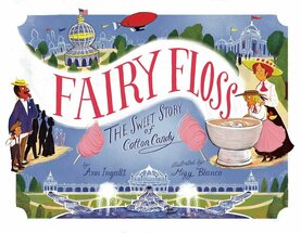 Two of your nonfiction picture books involve jazz music: THE LITTLE PIANO GIRL: THE STORY OF MARY LOU WILLIAMS, JAZZ LEGEND and J IS FOR JAZZ (such a fun read)! Can you share what sparked these stories? Are you a musician yourself? I can play the sticks if pressed into it. I do love music and still love to dance even though I’m a bit arthritic these days. I got the idea for both books on a day I subbed for my music teacher friend who had an ongoing unit on jazz. I wondered if a jazz alphabet book had ever been written. As I pondered who or what to use for the letter W, my jazz historian friend reminded me of Mary Lou Williams, the First Lady of Jazz. As I began to read about her, I was totally hooked. My sister, Maryann Macdonald, paired with me in the writing of that book. It sold first and about 3 years later, J is for Jazz sold. FAIRY FLOSS: THE SWEET STORY OF COTTON CANDY is another of your nonfiction picture books. What lead you to write this delicious story? Sonal Fry at Little Bee asked me to write this book. She gave me lots of freedom in deciding what to write. When I learned that the Electric Candy Making Machine was first introduced at the 1904 World’s Fair in St. Louis, I was hooked. I did quite a bit of the research at the UMKC Dental School Library since one of the inventors was a dentist. He also wrote books for children. How cool is that? 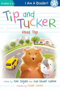 You have written several early reader books, including the forthcoming TIP AND TUCKER: ROAD TRIP (Sleeping Bear Press, 3/15/19), co-written with Sue Lowell Gallion. What was the process of co-writing like? Co-authoring with Sue is a dream come true! We really think alike and arrive at an ending in the same way. We are willing to defer to one another as we trust where the story will go. I’ve had equally good experience with my sister, Maryann, and with Barbara Stuber. She and I co-authored a book that is still slowly making the rounds. What do you love most about being an author? When I see a child smile, laugh, wonder, and learn from one of my books, I think I have done my job. That really is what keeps me writing. I plan to do this until my last breath. What is the most challenging part of being an author? For me that would be keeping all my files in order. I have many, many versions of each manuscript before it becomes a book. I study and compare them and see if there is any bit of magic in one before I discard it. 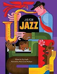 What is your editing process like? Do you belong to a critique group? I do belong to a critique group. Jody Jensen Shaffer and Sue Lowell Gallion and I try to meet up every couple of weeks or so. We read exemplars (recently published) and then share our own work. We may read each piece 2 or 3 times slowly and carefully. Then we play with possibilities and word choices, story arc, tension, etc. It is the most satisfying experience. We also talk about the publishing world, share our disappointments and successes. All very, very good. You have published over 25 books. Are there any particular favorites which hold a special place in your heart? I'm really proud of J IS FOR JAZZ. It was vetted by three important jazz historians and is accurate. I really loved studying jazz history and making it come alive with a bit of jazz slang. I hope my readers feel the same way. As you have many book launches under your belt, do you have any words of wisdom for debut authors regarding marketing/publicizing their new book babies? I’m not especially good at promotion. Thank heavens my publishers are. I do lots of school and library visits and sell books there. I have been to several conferences for librarians. These are very good. SCBWI conferences and literary festivals other good way to connect with parents, teachers, and students. I’d love to do another conference or festival this year. Maybe someone reading this will ask me to present. Here’s hoping. :) What advice would you give to writers out there in the query/submission trenches? Study the marketplace. Before I did this seriously, I had very few sales. Since that time, I’ve had nearly 40 more sales. I take about 15 minutes a day and search for editors’ wish lists, publishers’ lists, and names of new publishers. This really helps me direct my submissions. Be prepared for rejections. Take the bad with the good. What were some of you favorite books as a child? I loved the Cherry Ames, Student Nurse books and read them over and over hoping one day to actually be a nurse. As an early childhood and special education teacher, I did bandage plenty of knees and elbows from playground mishaps. My grandmother read A. A. Milne to me. I completely love his work, most especially the poem that goes, "When I was one, I had just begun…" What are a few of your favorite books as an adult? Louise Penny and Gary D. Schmidt are my all time favorite authors. They are in categories of their own making. I will admit to reading each of their books at least twice. Three time for OKAY FOR NOW. We’d love to know what you’re working on now. Any projects coming up? I am working with Jane True on a bio about Eunice Kennedy Shriver. Hoping to wrap that up this weekend and send it out. We have an editor with interest. Please cross your pinkies! I am also going to be writing two more Tip and Tucker books with Sue Lowell Gallion for Sleeping Bear and I have another silly book in the works that may go to Pajama Press. And a book idea, not yet fleshed out for Dawn Publications. Thanks so much for sharing your experiences with 24 Carrot Writing, Ann! Ann Ingalls writes for both children and adults and is the author of over twenty-five books. She loves chocolate, swimming, playing Bridge, and traveling. To learn more about Ann and her work, visit her website, www.anningalls.com. She is also on Twitter @AnnIngallsBooks.  Interview by Annie Cronin Romano Welcome Lori, and congratulations on your latest picture book, AWAY WITH WORDS: THE DARING STORY OF ISABELLA BIRD, which hits shelves March 1st! Thanks, Annie. Writing about Isabella Bird was its own adventure and I’m delighted to have the chance to tell you more about it. How did you come to be a children’s book author? Although I was always an avid reader, writing didn’t occur to me until I was a stay-at-home mother of three. When I was re-introduced to children’s literature, I wondered what I could write. I’ve been writing ever since. Can you share the inspiration for AWAY WITH WORDS? What drew you to share Isabella Bird’s story? Since Isabella Bird lived during the Victorian Age, like many people, I hadn’t heard about her. However, when I began searching online for women’s firsts, such as first woman doctor, first woman astronaut, etc. I discovered Isabella Bird was the first woman inducted to the Royal Geographical Society. Once I delved into some research, I knew I wanted to tell her unique and exciting story. AWAY WITH WORDS is a nonfiction picture book biography. What are some of the ways your process with this manuscript was different from that of your fiction work? Writing fiction and nonfiction has more similarities than one might imagine. In both cases, the author needs to bring the character to life and create an underlying theme that will be meaningful for young readers. For nonfiction, it requires a lot of research before I discover how I want to tell their story. Since picture books can’t and shouldn’t include everything about someone’s life, picture books have to be very focused and cut to the chase. I love picture biographies because they are so focused, illuminating the most fascinating aspects of someone’s life and his/her accomplishments. When I write fiction, however, it’s all up to me to come up with an appealing character and storyline. This involves a lot of introspection and exploration to discover the story I want to tell. Tell us about your road to publication for AWAY WITH WORDS. Was it bumpy? Smooth sailing? Just like Isabella Bird, this picture book manuscript had its own journey with a lot of twists and turns. I began writing the manuscript 10 years ago and it went through many revisions. However, none of them seemed quite right in spite of an agent’s interest and input. In time, the agent and I parted ways, and I put the manuscript away. However, a few months later, I decided to take another look since I still believed in Isabella’s story. When I revised this time, a metaphor sprang to mind that became the heart of the story. “Isabella was like a wild vine stuck in a too small pot. She needed more room. She had to get out. She had to explore.” This comparison created a unique theme that brought Isabella’s story to life in a way that other versions hadn’t. Along the way to publication, there was a new agent, new editors, and a search for the perfect illustrator. After more than 100 years, I’m delighted that Isabella is off on a new journey as young readers discover her exciting story. In terms of your writing process, do you plot before you write or are you more of a pantser? Oh, wouldn’t it be nice if I knew where I was going when I begin to write? Sometimes I do, but most of the time I am a pantser---writing by the seat of my pants until I figure out where I’m going. My manuscripts usually start with the crumb of an idea—a title, a character, an illustration—then I go this way and that until I find my way. What is your editing process like? Do you belong to a critique group? I spend a lot of time writing and revising. It takes time to develop a character, storyline, and theme, as well as a lively, read-aloud text. With each revision, the manuscript gets better. New ideas come to mind, I understand the character better, and language begins to flow. Once I’ve completed a manuscript to the best of my ability, I share it with my critique groups—one that meets in person, and another online. Over the years, I’ve found that trusted critique groups are invaluable. They not only celebrate the things that work, they point out areas that don’t make sense and offer suggestions. After I get feedback, I revise again until I’m happy with the result. We don’t always agree, but that’s okay. Writing is a subjective endeavor and, in the end, an author must follow their heart. What do you love most about being an author? When I look back on the books I’ve published, I’m so delighted to be part of the picture book community. For me, there is something magical about shaping words into stories, seeing them come to life through the eyes of extraordinary illustrators, then sitting down, book in hand, and reading those stories to young readers. What is the most challenging part of being an author? Coming up with stories on a regular basis and all the rejection that’s part of every author’s life. On your website, you mention some of your favorite books as a child, including Where the Wild Things Are and A Wrinkle in Time. What are some of your favorite books now? These days, I have so many favorites, it’s impossible to name them all. However, some of my favorite picture book authors include Oliver Jeffers, Julie Fogliano, Liz Garton Scanlon, Don Brown, and Alex Latimer. You have published over 100 books. Are there any that are particular favorites of yours or hold a special place in your heart? As you can imagine, they’re all meaningful to me because I spend so much time on each manuscript. However, one reader favorite is Cowpoke Clyde and Dirty Dawg published by Clarion. It’s a wild, rambunctious read aloud, illustrated by wonderful Michael Allen Austin, that became one of Amazon’s Best Picture Books in 2013. We’d love to know what you’re working on now. Any projects coming up?
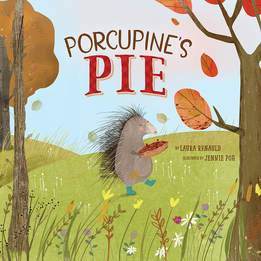
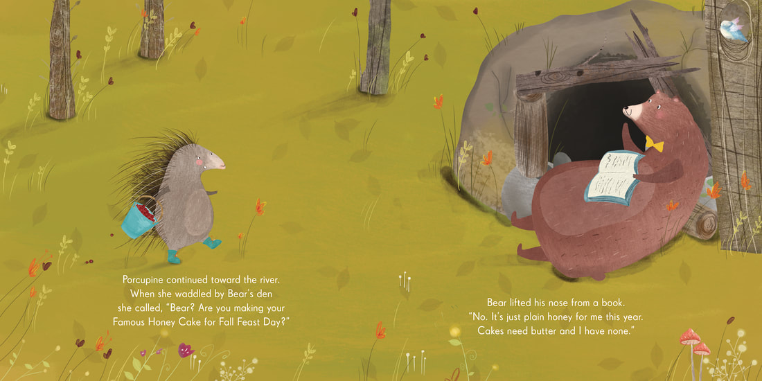
I have some wonderful projects coming up. In 2020, Houghton Mifflin Harcourt will release another picture book biography that will be illustrated by the talented Chloe Bristol. Because its publication date is still a year out, mums the word about the subject for now. But I’m especially looking forward to sharing this individual’s unique and curious story. I’m also excited about the recent sale of a new fiction picture book. I’ll be able to share more details in the coming months once the illustrator has been selected. What advice would you give to writers out there in the query/submission trenches? Read the genre of stories you want to write. Study story structure, beginnings, middles, and endings. Study character and voice. Then, keep trying. Be persistent. Persistence is key. As you keep writing, your manuscripts will get better. Don’t be in a rush to submit. Rather, focus on making each manuscript the best that it can be. When it’s irresistible, success is only a submission away. Thanks so much for sharing your experiences with 24 Carrot Writing, Lori! Lori Mortensen is an award-winning children’s book author of more than 100 books and over 500 stories and articles. Her upcoming picture book biography, Away with Words, the Daring Story of Isabella Bird (Peachtree), is about a Victorian traveler who defied society’s boundaries for women and became the first woman inducted into the Royal Geographical Society. Recent picture book releases include If Wendell Had a Walrus (Henry Holt), Chicken Lily (Henry Holt), Mousequerade Ball (Bloomsbury) illustrated by New York Times bestselling illustrator Betsy Lewin, and Cowpoke Clyde Rides the Range (Clarion, 2016) a sequel to Cowpoke Clyde & Dirty Dawg, one of Amazon’s best picture books of 2013. When she’s not letting her cat in, or out, or in, she’s tapping away at her computer, conjuring, coaxing, and prodding her latest stories to life. For more information about her books, events, critique service, and upcoming releases, visit her website at www.lorimortensen.com.  Hosted by Annie Cronin Romano Welcome Laura, and congratulations on the publication of your debut picture book, PORCUPINE’S PIE! How did you come to be a children’s book author? I’ve always loved to read, but it wasn’t until I taught third grade and used picture books as teaching texts across the curriculum that I decided I wanted to try my hand at writing. I was fascinated by how a 32-page illustrated book could encourage, inspire, or inform. I was hooked! Can you share the inspiration for PORCUPINE’S PIE? Was there a particular reason you chose a porcupine as the main character of your story? And do you enjoy baking? I was inspired by Tammi Sauer’s post during PiBoIdMo 2014 (Now Storystorm, hosted by Tara Lazar), which challenged writers to frame a story as a How-To Book. My brainstorming that day included this jot in my notebook: “How to make porcupine pie (or a pie for a porcupine)”. Even though it did not evolve into a How-To Book, that was the humble beginning of PORCUPINE’S PIE! Since the title came first, I think it was the alliteration of Porcupine’s Pie that spoke to me, rather than there being a particular reason that a Porcupine became my main character. I do enjoy baking and the idea that food brings people together was an important theme for my story. Tell us about your road to publication for PORCUPINE’S PIE. Was it bumpy? Lots of twists and turns? Smooth sailing? I got serious about writing for children in 2011 when I joined SCBWI. I’ve written about 90 stories and received approximately 120 rejections since I started tracking them in 2015. I wrote my first draft of Porcupine’s Pie in 2014, won the Beaming Books Picture Book Writing Contest in 2016, and am holding it in my hands and sharing it with kids in 2018. A long journey, but well worth it! In terms of your writing process, do you plot before you write or are you more of a pantser? Both! For Porcupine’s Pie, I brainstormed a few possibilities for the plot since my idea started with the title. But as I drafted, I veered off my plotted path and came up with a much better story. What do you love most about being an author? Connecting with kids and being a small piece of the puzzle that gets them excited about reading and writing. And being part of the amazing kidlit community. What is the most challenging part of being an author? The waiting! What were some of you favorite books as a child? I was going through my childhood picture books recently and rediscovered Panda Cake by Rosalie Seidler. It struck me how similar the title is to Porcupine’s Pie! That book must have planted a story seed in my head long ago. What are a few of your favorite books as an adult? The Giver by Lois Lowry Prodigal Summer by Barbara Kingsolver A Monster Calls by Patrick Ness We’d love to know what you’re working on now. Any projects coming up? I’m pleased to share that my next book, a nonfiction picture book biography about Mister Rogers will be published in Fall 2019 by Atheneum. It is called Fred’s Big Feelings: The Life and Legacy of Mister Rogers, illustrated by Brigette Barrager. I always have multiple manuscripts in progress. Some of the ones I’m working on now involve robots, rabbits, and puppets. What advice would you give to writers out there in the query/submission trenches? If you are serious about getting published, do everything you can to improve your craft, build your personal kidlit community (i.e. critique group), and, importantly, cheer others on. Once your stories are the best they can be, submit, submit, submit! Compile a list of agents and editors you’d love to work with. Track your submissions. Celebrate your rejections. (It means you’re getting responses!) For most people, it takes years to connect with the right agent or editor for your work. Be determined. Be persistent. Be in it for the long haul. Where can people learn more about you and your book? You can find me on the web at laurarenauld.com and on social media: Twitter - @laura_renauld Facebook – @kidlitlaura Instagram - @laurarenauld Thanks so much for sharing your experiences with 24 Carrot Writing, Laura! 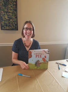 Laura Renauld is a former third grade teacher who now spends her days imagining and creating. When she is not writing picture books about porcupines, pirates, and pickles, Laura can be found on a trail, at the library, or in the kitchen. She lives in Northern Virginia with her husband and their two story-telling sons. This is her debut picture book. |
Peruse blogs for advice and tips from KidLit creatives.
Categories
All
Archives
April 2024
Click to set custom HTML
Click on the RSS Feed button above to receive notifications of new posts on this blog.
|





 RSS Feed