 ~Hosted by Amanda Smith The Writers' Loft in Sherborn, MA is a community dedicated to helping writers achieve greatness. They have a quiet, drop-in writing space and a community room for special events or just hanging out. They are also on the cusp of releasing their third anthology, FRIENDS AND ANEMONES: OCEAN POEMS FOR CHILDREN featuring writers and illustrators from the Loft. Many of these Lofters also worked on the first poetry anthology AN ASSORTMENT OF ANIMALS. 24 Carrot Writing asked the illustrators about the experience of working on a joint project. This anthology is a collaborative project involving 30+ creative souls. What did you enjoy about working alongside other creatives? What was easy? What was challenging? In which ways did it stretch you? What aspects did you have to take in consideration as you created and edited your artwork? 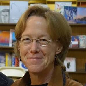 Priscilla Alpaugh: Working on the Anthologies was a rare chance to work with such a large group of artists. It was wonderful to see each other’s work and be able to share constructive criticism with one another. It’s a treat to read the poems that the Lofters wrote. So many talented writers! It’s energizing to know that everyone is working towards the same goal. It is always a challenge to combine different poems on one page or spread. I was lucky and got one of the easier combinations. In each case I went in with a pretty clear idea of what I wanted in the image. Starting with thumbnails for composition and then sketches for content led to a final sketch where I could also consider value. I typically combine watercolor and pencil digitally, but this time it was mostly all digital. To learn more about Priscilla, visit http://priscillaalpaugh.com/ 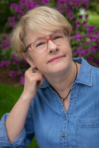 Leanne Leutkemeyer: I enjoyed the feeling of community. I love the energy and excitement of being in a room with creative people. I enjoyed being part of the team. This project introduced me to so many wonderful and talented writers and illustrators. The timing of this project was perfect for me. It took my mind off the world and let me escape into oceans, play with whales and stingrays, and make art. The Zoom meetings helped fight feelings of isolation. However, getting art direction from a group can be a challenge. It can be intimidating to sit shoulder to shoulder with artists you admire. In a meeting full of voices, it’s hard to catch and absorb all of the suggestions as they fly by. I scribbled many notes. It’s more challenging to have group input, but also exciting and inspiring to see the incredible work everyone was putting out. In which ways did it stretch me? I developed new painting techniques to work large and discovered different scanning techniques. I’m excited about the new photoshop skills I’ve picked up through this project. In the past I’ve always fixed mistakes on the illustration as I painted or started over till I got it right. It’s pretty mind-blowing to be able to add an extra tail on a stingray while painting and know that I’ll be able to take the earlier one out that wasn’t working, and not have to repaint the whole illustration. To learn more about Leanne, visit https://www.leanneluetkemeyer.com/ 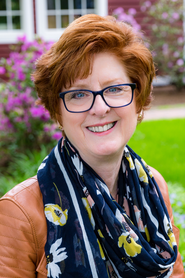 Deb O’Brien: The artists had several challenges in this anthology. We received a lot more poems this year, which meant several poems per spread. Not only did our illustrations have to support each poem, we had to make sure that the art and the poem fit on the page. Another challenge was the Corona virus. Normally, the artists and designers would get together several times to discuss color palettes, design, and layout. This time, we had to do it all via Zoom. We made it work, but it wasn’t easy. Some artists couldn’t even think about art. I was grateful I had this assignment; it gave me focus, direction and deadlines. I was able to block out the world and dive into my work. I’m very proud to be a part of the anthology and can’t wait to see the published piece. To learn more about Deb, visist https://deb-obrien.com/ What did you learn about yourself, your creative process, book-making, and/or marketing while working on the anthology?  Amanda Davis: I was honored to have the opportunity to illustrate several poems in this year’s anthology. It’s the first time my illustrations are appearing in a published children’s book alongside many other talented creators to boot! For this particular anthology, illustrators brought to life the fun and crazy creatures of the sea. I knew I wanted to garner a likeness to the creatures in the poems while also putting my own original spin on them. Typically, my process involves drawing from my imagination or from real-life models or scenes. Since I didn’t have access to real-life models of vampire squids or narwhals, I knew this part of my process was going to be a challenge. With the help of the Loft team, I learned more about properly using reference images, avoiding copyright issues, and finding creative ways to craft original models using materials such as clay. Because I was illustrating for publication, I also felt an added pressure to get it right. This meant practice, practice, practice and revise, revise, revise! I enjoyed working collaboratively with the other artists and design team who provided me with valuable feedback that helped polish my work. The whole experience was a learning process, and I’m grateful for the knowledge and patience of the Loft community. I can’t wait to share our beautiful, seaworthy collection with the world! To learn more about Amanda Davis, visit https://www.amandadavisart.com  Joy Nelkin Wieder: Working as a team was the most exciting and educational process in working on an anthology with other Lofters. I learned so much about marketing a children’s book from others on the team that I was able to apply everything I learned when my own book launched in January. Everything from writing up a press release, to making contacts at local bookstores and media outlets, to participating in book signings and presentations, to creating marketing materials such as flyers and posters. During the marketing of An Assortment of Animals, I took the lead in putting together art exhibitions of our original artwork from the anthology. Our framed illustrations were displayed at the Art and Frame Emporium in Westborough and the Hopkinton Art Center in Hopkinton. We currently have an online exhibit of illustrations with the Acton Memorial Library – check it out here: https://www.actonmemoriallibrary.org/events-programs/art-exhibition/ Visit Joy's website at http://jnwieder.com/ to learn more. 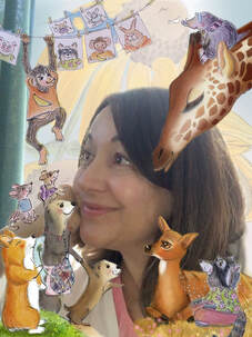 Doreen Buchinski: I was honored to design An Assortment of Animals. It was a wonderful opportunity and a chance to challenge myself. As a graphic designer, I’ve created brochures, logos, promotional materials, etc., but hadn’t explored designing picture books. I was excited and terrified of the herculean project ahead. Applying principals of good design to the book layout—like alignment, balance, repetition, contrast, type, and space—was priority. Tasks included: researching fonts, colors, and on-demand printing, managing art files, emails, edits, and file prep, while also completing my own anthology illustrations. Yes, there were days when the project felt overwhelming—but I stayed focused on each day’s priorities. With superb anthology editors, Kristen Wixted and Heather Kelly, the Writers' Loft founder, at the helm, the development and completion of the book was successful. Collaborating with talented illustrators and authors, and displaying their beautiful art and poetry on the pages of the book were experiences I will always treasure. Visit Doreen's website at https://www.doreenbuchinski.com/ What was your approach when you first received the poem(s) you were to illustrate? Walk us through your process.  Sarah Brannen: For me, the first step was picking the creatures I was going to illustrate. I went back and forth with the editors as they sorted out who would make art for which poem. I specifically requested jellyfish and they were kind enough to make that work. I also thought I’d like to do sea glass. I was an avid collector as a child and I still have a jar of my very best pieces, which include even rare colors like yellow and pink. Kristen Wixted and I talked a lot about how to group the poems. It was her idea to do a spread of things found on the beach, so that I could do a trompe-l’oeil image of everything spread out on the sand. At the last minute Kristen asked me to illustrate the very last poem in the book, Sea Serenity. My most recent book, A Perfect Day, is set on the ocean and it opens with a very calm image of the ocean at dawn. We both felt that something similar would be perfect to close the anthology as well. I sketched a very old wooden lobster pot buoy that I’ve had since I was little, although I changed the colors to white, blue and green. It’s meant to evoke, in some way, the earth itself. Old buoys have numbers carved into them so I put “2020” on the one in the illustration. My web site is www.sarahbrannen.com.  Jodie Apeseche: When illustration assignments were divvied out, I was super excited. I felt that everything was in my wheelhouse-lobsters, cuttlefish, crabs, sea otters, seahorse and sea dragon-yup those would be fun. The tricky part was how to make my illustrations connect to the poems while keeping in my style of painting. For example, after reading Lobster Rainbow more carefully, I was faced with a predicament. I had not realized that I would have to paint 6 different colored lobsters. I couldn’t figure out how to do that without making a very cluttered illustration. Solution, I created a lobster grid a la Andy Warhol. Problem solving is such a big part of illustration and I owe gratitude to author, Jean Taft, for pushing me to that end. For more about Jodie, visit jodieapeseche.weebly.com or http://art-jam.net/  Liz Goulet Dubois: When I first received my poem from Lynda, I was surprised! I was expecting perhaps a short, pithy poem. What I received was an epic tale of a seal, underwater dentistry and a duplicitous shark! I approached illustrating this the same way I would approach a picture book. I distilled the text down to what I thought were the key scenes, and created individual sketched vignettes in pencil that could wrap around and enhance the text. The drawing was challenging also because of the scale differences in the characters depicted: everything from a blue whale down to a jumbo shrimp! After the sketches were settled and approved, I scanned them and colored them digitally, which is my usual method. Hopefully readers will be amused by the sight of a shark brandishing dental tools, and wearing a bib! To learn more about Liz, visit https://www.lizgouletdubois.com/ FRIENDS AND ANEMONES: OCEAN POEMS FOR CHILDREN is set to launch in November and is chock-full of whimsy, fun, and freaky animal facts that will delight children and adults. To learn more about the Writers' Loft visit www.thewritersloft.org/ and www.thewritersloft.org/anthology for information regarding previous anthologies.
2 Comments
By Ashley Benham Yazdani In most picture books the characters that we write about are humans, or animals, or at least some kind of organism. But what if you want to tell the story of a place? When writing my nonfiction book, A Green Place to Be: The Creation of Central Park, I sought to tell the story of one of America’s beloved landscapes and its two designers, Frederick Law Olmsted and Calvert Vaux. My own interest in Central Park began long ago, and was initially driven by curiosity about its creators. When I learned that there was truly nothing natural about the seemingly nature-made landscape of the park, I absolutely had to learn who had made it, how, and why. Olmsted and Vaux’s environmental and social motives were deeply inspiring to me, and I desperately wanted to tell their story. But as I researched and wrote, I discovered new questions. How did the land get to the state where it needed such healing? Who was there before it was a park? How did the land transform into a park, and (I still wonder) how does it compare to how it was before it was occupied by white people? After researching the answers to these and other questions, I found the land emerging as a third character in my writing. Giving a voice to the land is something that has long interested me, and the need to do so now feels more urgent than ever. Our planet has existed long before us, and will continue to go on long after we are gone, but what state do we want to leave it in, really? The Earth is at a tipping point because of our lifestyles, and every word, every action, every book we make on its behalf matters in the fight for a healthier planet. So when I approached my work on Central Park, I felt a real sense of urgency. Olmsted and Vaux sought to preserve the land, bringing it closer to its natural state and healing decades of harm through careful engineering. The end result of their work is a landscape that has flourished, drawing in both wild creatures and humans alike with the magnetic serenity of a natural landscape in perfect alignment with the qualities of its native climate. Theirs is a story that could be recreated almost anywhere today with a bit of work. Unfortunately, we humans seem to have a hard time empathizing with things that don’t look like us, especially landscapes, which have no apparent consciousness. So how do we craft a written portrait of a landscape that makes the reader care? In the case of my book, the success of the landscape was tied with the success of my two other main characters, and I reasoned that if the reader was invested in them, then they would care about the fate of the land as well. Painting a picture of the land through the eyes of humans is just one way to go about it, but you could do the same thing with animals or other organisms, or you could directly give the land a voice and have it speak for itself. These are only a handful of the possible approaches to this, and connecting with the land you are writing for will provide deeper inspiration. You might want to do some character development exploration work when writing for the land. Here are a few of the questions I asked myself when writing for Central Park: •What is the current state of the land? •What is the land’s history? Especially consider its history before vs. after white people were there, or even before indigenous people arrived. •Has the landscape experienced any major changes, or were they gradual? •Who directly made it the way it is today? What can you learn about them? What was their motivation? •Who were the land’s first caretakers? Present caretakers? How do the two differ in ideals or goals? •Was there ever any controversy regarding the land? Did anybody ever damage or exploit it? If so, has the land healed, or does it still need help? •What effect, if any, can you have on the land today? Is there a localized cause that needs attention there? The Earth does speak to us, if we listen carefully enough. It may be slow and quiet, with a pulse that beats at a seasonal pace rather than a human one, but all land does have stories to tell. These are discovered by geologists, archaeologists, historians, and regular unscientific people who simply pay attention to the patterns of nature. Children are particularly wonderful observers in this way. By telling these stories to children (and to the adults that read to them), we can help others to cultivate empathy for the most essential character in all of our lives: the Earth.  Bio: Ashley Yazdani is a picture book author/illustrator, reader, and nature lover. She received her MFA from the Illustration Practice Program at the Maryland Institute College of Art, and her BFA in Illustration from California College of the Arts. She has taught illustration courses at the Maryland Institute College of Art, and Towson University. Her debut book, A Green Place to Be, is currently available from Candlewick Press and can be found at your local bookstore. Her tools of the trade are watercolors, colored pencils, and Photoshop, but she also enjoys embroidery, block printing, and screen printing. When not pushing pigment or pixels around, Ashley can be found reading, sewing, or running around in the great outdoors. She lives in Minneapolis with her husband and son.  Illustrators from The Soaring 20's PB debut group have joined us to celebrate The 24 Carrot Writing Illustrator Bonanza! This tenacious and talented group has spent 2020 launching debut books in the midst of a pandemic! They share how the use art to capture just the right mood and tone in a story, how they hone their craft, and what keeps their skills fresh. Welcome to the Illustrators of The Soaring 20's! Let's start at the beginning of the illustration process. When you first receive a manuscript to illustrate or you complete your own manuscript, what is the first thing you do?
Painting When the sketch dummy was approved. It was time to once again panic paint. I painted digitally mainly because it allowed for many, many, many, more mistakes. And there were many. I started first by painting page one, then two, then three (do you notice the pattern). For me, this was a mistake. I had to back up and think stylistically how I wanted this to look with color, I needed to define my color palettes, and I had to pick (and stick) with a set of digital brushes for the book prior to painting the book. I ended up creating four digital palettes. One each for Goat Girl and Merle, one for the backgrounds, and another for supporting characters. My Photoshop document was set-up as spreads (20”x10" + bleed) in folders with sub-folders for individual pages/panels/spots. While my document was actual size, I worked at a higher than needed resolution for layout flexibility/adjustments. I also had a template layer showing my text placement for each page as I painted. Instead of painting a complete single page, I jumped through the pages by blocking in color first for Merle, then Goat Girl, then backgrounds/other characters. This allowed me to stay focused especially early one with character finishes - Ideally I would have done full character/environment studies prior to painting - Greg Barrington is the author/illustrator of COW BOY IS NOT A COWBOY (HarperCollins, October 20, 2020) Is it easier or harder to illustrate someone else’s story, versus a story you’ve written yourself?
story is that you care so much about this story you’ll want everything to be perfect, thinking that everything in this story os a reflection of your taste and ability - but the problem is perfectionism kills creativity. Small breaks and critique groups can help during those moments of self-doubt. Though the reward of publishing my very own story makes it all worth it! - Isabella Kung is the author/illustrator of No Fuzzball! (Orchard Books, August 4, 2020)
What does the revision process look like for an illustrator?
When you are not working on an assignment, what do you do to grow your craft/art?
Watch webinars I have probably learned the most about the craft of writing/illustrating picture books from webinars—particularly the ones offered by StorytellerAcademy.com and from regional SCBWI chapters. I’ve had the opportunity to learn from top-notch authors/illustrators, art directors, editors, and agents all from the comfort of my own home and for a relatively low cost. I find they often give me the confidence and/or inspiration to go just a little bit outside my comfort zone and try out new story structures, formats or techniques. - Abi Cushman is the author/illustrator of SOAKED (Viking Books for Young Readers, July 14, 2020)  To learn more about The Soaring 20's Picture Book group please visit them here.  Guest interview of illustrator Qing Zhuang Often there is a cloak of mystery surrounding the relationship between an author and an illustrator. When illustrator Qing Zhuang signed on to illustrate How Long Is Forever?, I did what every good author is instructed to do. I sat down and zipped my lip. The idea, and it is a smart one, is to allow the illustrator freedom within their creative process without being hampered or interrupted by the pesky author. It was hard. And I was grateful when the editor sent me sketches and asked for my feedback. But I wonder, what did that process feel like from Qing’s perspective? Let’s ask. Qing, I’m so happy that you are joining us at 24 Carrot Writing as we celebrate our Annual Illustrator’s Month. Can you tell us a little about your journey to becoming an illustrator? Sure! I studied illustration in college and spent many years afterwards trying to improve my work. I went to SCWBI conferences making incremental progress. I had a lot of growing to do, personally, practically and artistically. So even though I had some good foundational skills and recognition from teachers in my school years, my work was all over the place. It took a long time to figure things out when I graduated. Meanwhile, all my talented friends were getting cool art jobs, awards, reasonable income, name recognition and not horrible dates! Dang! Sometimes I’d cry on the bus after getting yelled at by some grumpy and condescending customer at my retail job. This is not what I’d imagined when I won the children’s version of the Ezra Jack Keats bookmaking contest in 6th grade and decided I was going to become a great writer-illustrator! Alas, I marched on in my tortoise pace. Eventually my work improved and I tightened up my portfolio by taking out work that didn’t fit and focusing on a singular style as best as I could. The road here was not super glamorous and not without doubters so it takes a lot of conviction within myself that this is what I must accomplish in this lifetime. I took my portfolio to the NJ SCBWI conference and met Karen Boss our Charlesbridge editor there. The rest is history! A few months after Charlesbridge bought How Long Is Forever?, I received an email from editor Karen Boss letting me know the Art Department had identified three potential illustrators for the book. I went into major cyber stalk mode. All three were fantastic, but the drawings on your website had me convinced that you were the best pick. Did you know I wrote a four page email back with pics from your website as proof? How did you first hear of the project? And what made you sign on? I wish I could read why you liked my work best out of the three! The competition is SO fierce! I signed on because of how simple but deep it is. This is a story that can be as sweet or thought provoking as you want it to be. I just remember gazing up at the sky as a child getting lost pondering the nature of time and forever-ness. “How Long is Forever?” Can spur such a philosophical discussion with young ones but it can also be about the down to earth experiences of familial love and the creature comforts we share with the people we love. It can be about losing a grandparent. When I showed the manuscript to my now husband, he started tearing up. He said it reminded him of his own grandfather who used to make him Chinese pancakes and that was his favorite memory that he will keep forever of this person whom he loved so much. I knew that this story can potentially mean something special to each reader so I was excited to be a part of it! Qing, I'll send you that email. But for the readers here, I'll share a few of the illustrations Qing had on her web site that made me fall in love with her talent! Here is a reason number one on why illustrates should set up a website, make it easy to find, and populate it with your work! What was the first thing you did when you received the manuscript to illustrate? What was your process? I made many thumbnail sketches, researched reference photos and did character designs. I based the farm on the Queens County Farm as well as the farm at Manhattan Country School, where I teach. They have a fantastic farm program and children make wonderful memories at its farm in the Catskills every year. One of the exciting things about working on this project is the opportunity to try to honor the joy of spending time in the farm and in nature. In this age where many children spend hours doing virtual farming and building in a video game I think it’s really special to have a book that explores just running free and asking questions and investigating out in the world. But as a city girl who also spends too much time online, I needed to do a lot of research on things like tree species and tractors and which way a weathervane blows (the arrow points against the source of the wind). It took many tries to get it right. This could be said about every stage from beginning to end. Sometimes the illustrations didn’t fit the layout or just something was off with the pacing and I had to scrap it and do it over! I am so grateful to have the patience of the editors because the book really improved from every version. My manuscript did not have illustration notes and aside from the editor asking me for “minimal” feedback on your illustrations, we didn’t connect until after the book was sent to print. I might have sent you a quick “you’re doing great, keep it up” pep talk email but I wonder what direction you got from Karen Boss and/or the Charlesbridge Art Department. There were many discussions about the layout of the story because ultimately the words and their legibility are paramount. So depending on where they decided to put the text the whole composition and even perspective of the scene had to change. There were also discussions about the type of tree that would be in the book. The character designs also took a couple of tries. I made many different potential Masons and the editors picked the one we know and love pretty easily. But I had to redo all my designs of grandma and grandpa because they looked too old fashioned. Somewhere in me I am still pouting that I wasn’t able to do the sweet and chubby grandparents in my initial sketches because it’s kind of my nature to be sappy and nostalgic. However, I’m also glad I was challenged to make more contemporary looking grandparents, especially with our very hip and artsy grandma design who I based off of my college art professor. I also tried to make grandpa kind of cool looking so I ditched the overalls and gave him a jean jacket and nice shoes. Someone said he looks like Ernest Hemingway. My friends make up stories about how they met as young artsy hippies and decided to retire at a farm where the grandma makes pottery and takes photos of pastoral landscapes. Anyway, many changes were made at all stages of the book. Anytime anything changes it affects the whole book. For example, there were these cute bird feeders hanging on the house porch but they were blocking the text, so I had to edit them out of all the pages. Another example is the editors wanted me to depict teeth. Stylistically, I rarely drew teeth so at the last minute I had to photoshop in the teeth of all the characters. Haha! Now you know how the sausage is made. 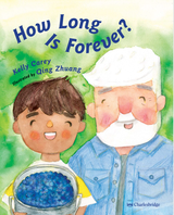 It is important for all children to be able to recognize themselves in the books they read. The manuscript never offered a physical description of the character and you smartly took the opportunity to present Mason with darker skin and his grandparents with light skin. Can you talk about that decision? I just want different types of families to be portrayed because whatever we see in the media gets legitimized and embraced. It’s wonderful now to see so many books and other kinds of media beginning to embrace a diversity of experiences. In the school I work at, there are so many students who are adopted, from a mixed or blended family, or simply don’t look like their caretakers for some other reason. I also have friends and professors and colleagues who are in such families. I am excited that a sweet book about love and timelessness can reflect them too. I mean why not? Teachers and parents now are so good at discussing questions about different families if they do come up. For my character designs of Mason, I featured many different looks, actually referencing some children I know. It’s just how I work, I don’t like to just make stuff up, I tend to care about it more if it is based on things and people I know in real life. You recently signed with an agent! Congratulations! How did that happen? And how is it changing how you are working? What are you working on now? Thank you! For the past couple of years different literary agents have reached out to me even before I had a real dummy ready to present to them. I knew that getting an agent is a long term commitment and didn’t want to rush and find someone I don’t feel right with. So I worked on How Long is Forever? and didn’t think too much about representation because I wanted to focus on my debut book! After the book was sent off to the printers, I started to read some interviews of the different agents I had been acquainted with but they didn’t seem to fit. At a portfolio review, the reviewer suggested that I query Wendi Gu of Sanford Greenburger Associates, so I wrote her name down and read her online interviews. Those interviews resonated with me. Then I saw her speak at a virtual panel and found her to be very professional and warm. I still felt like I wasn’t ready to reach out because I am a chicken. Then an editor at Holiday House who I had met a year ago emailed me asking me if I have finally written a story for them. I had a dummy in progress about grocery shopping with my mom which I sent anyway to see if there would be any feedback. To my surprise they enjoyed it and offered a deal! I really wanted an agent to help me negotiate this time so I reached out to Wendi and fortunately she replied right away! We had a few Zoom meetings and now I can feel very glamorous and tell people to contact my agent if they want to work with me! 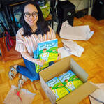 Qing Zhuang is an illustrator and elementary educator based in New York City. She holds a BFA in Illustration from Maryland Institute College of Art, Baltimore, and a MA in teaching from School of Visual Arts, New York. How Long Is Forever? is her debut as an illustrator. She is represented by Wendi Gu of Sanford Greenburger Associates. Qing's debut as both author and illustrator, Rainbow Shopping will launch from Holiday House in the summer of 2022. To learn more about Qing, visit her website at www.qingthings.com. To purchase a copy of How Long Is Forever? click here. ~Hosted by Amanda Smith Welcome to the final installment of 24 Carrot Writing's Graphic Novel Virtual Panel Discussion. Over the last two weeks (Part 1 and Part 2), our talented panelists have shared insights about the strengths of graphic novels and their process as creatives. Join our panel as we jump into the last two meaty questions: Middle school students seem particularly drawn to graphic novels, and often graphic novels are set in middle school. What does that communicate about the market for upper middle grade/ lower young adult readers? Are graphic novels purposefully aimed towards the middle school reader, or is there something in the graphic novel format that perfectly mashes with the middle schooler’s brain? Breena Bard: Middle schoolers are taking their first steps toward independence, developing their own beliefs and opinions in a way that they hadn’t before. They are exposed to a diversity of ideas and people, and as they begin to open their minds, they are perfectly primed to receive a radical new method of storytelling. Kids are free of the biases that keep many adults away from comics, and they aren’t pressured to maintain a high-brow reading list. And as long as adults react to graphic novels by wringing their hands or turning their noses up, graphic novels will also have a certain rebellious spirit that might attract middle school readers as well. Plus, comics are just super fun! Terri Libenson: I’m not sure, really. My characters are all 13 and in seventh grade, yet most of my readers are younger, often in third through sixth grade. Many kids read “up”; that is, they tend to read about characters older than them. I’m not as knowledgeable about what 7th-9th graders are reading, but I personally think there is an opportunity for graphic novels geared for that age bracket. Tom Angleberger: Middle school is such a weird time when kids sometimes feel like they should be giving up the type of books they loved in elementary school and reading big thick books. The growing acceptance of graphic novels creates a loophole here. A kid who read Smile in third grade can read Guts in seventh grade. (Of course, as far as I’m concerned, kids should keep reading great kids’ books with pride FOREVER!) Terry Ebbeling: Middle-school students are high energy and don’t often have a lot of “sit” in them. They are also visual learners. Graphic novels appeal to this age because of the pictures which break up the prose and allow students to “see” the story. While middle-school students enjoy graphic novels, there are also a number of authors who gear their graphic novels towards upper elementary students and even high schoolers. Honestly, I like them, too! What would you like to say to those well-meaning adults who act as gatekeepers regarding graphic novels? To those who see graphic novels as inferior reading? Kayla Miller: Comics ask readers to use different skills than prose books. To really read a graphic novel, you have to read not only the text, but also to observe environments, body language, and facial expressions. It can be a really engaging and emotional experience. When reading prose, you have to imagine the visuals based on the descriptions given to you and fill in details about the world around the characters, but when you’re reading comics you have to fill in the characters’ inner worlds and use context clues from the art to decipher what they’re thinking and feeling. I don’t think the skills developed reading comics are any less important or useful than those that students gain while reading prose novels. I also get comments all the time from parents that their reluctant readers become eager readers when it comes to graphic novels. If you believe that fostering a love of reading in younger generations is important, you’re only getting in your own way when you disregard graphic novels. Breena Bard: They should try reading some :) Really though, the fact that graphic novels are told with pictures should not disqualify them, and in fact makes them more accessible and engages students’ brains in a really unique way. Perhaps there is fear because graphic novels are a relatively new medium, but so were computers and tablets, and most schools utilize those to great success. Take time to read some of the new middle grade graphic novel classics (ask a middle schooler and they will surely have a list for you!) and keep an open mind to the possibilities these stories and this exciting format have to offer. They really are quite wonderful! Terri Libenson: It couldn’t be further from the truth (and if it helps, I avidly read comics as a kid, and now I read such a wide range of books, from non-fiction to fiction, including – yes – graphic novels for adults!). As I mentioned, graphic novels can be quite layered as well as visually stunning and rich in story. And then some are just plain fun, and that’s okay. Graphic novels vary just like prose books. And they are, indeed, BOOKS. Tom Angleberger: I think people are hung up on word-count. They assume 100,000 words is better than 1,000. Or 100. Or zero, in the case of wordless graphic novels. Well, that’s just dumb. Do they also assume that a novel by Joe Smedlap is better than a sonnet by Shakespeare? I think we should judge books on how many brain cells they light up. Trust me, Dog Man lights up a lot more brain cells than Tom Sawyer Abroad. (I was forced to read Tom Sawyer Abroad in 7th grade and am still mad.) Terry Ebbeling : I would tell those reading “gatekeepers” of graphic novels that there are different strokes for different folks in all areas of life, including reading. If students enjoy graphic novels, they are READING! Yay! I do not recommend a steady diet of any one genre, including graphic novels. But, if this genre gets kids into books, then let’s allow and encourage graphic novels. Thank you to Terri, Breena, Kayla, Tom, and Terry for a fabulous discussion. I know I am paying closer attention to details in the settings and characters, as well as other context clues when I read graphic novels. I am also inspired to think visually and cinematically about the scenes I write, and I cannot wait to get my hands on our panel's new releases in May (if I can pry them from my own middle schooler's hands!) BIOS: 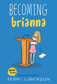 Terri Libenson is the cartoonist of the internationally syndicated daily comic strip, The Pajama Diaries, and the author of the best-selling illustrated middle grade novels, Invisible Emmie, Positively Izzy, and Just Jaime. She was also an award-winning humorous writer for American Greetings for 22 years. The Pajama Diaries launched with King Features in 2006 and currently runs in hundreds of newspapers throughout the country and abroad. Pajama Diaries has been nominated four times for the Reuben Award for “Best Newspaper Comic Strip” by the National Cartoonists Society and won in 2016. Terri lives with her family in Cleveland, OH. Her newest novel, Becoming Brianna will be available in May 2020. To learn more about Terri, visit http://terrilibenson.com/ 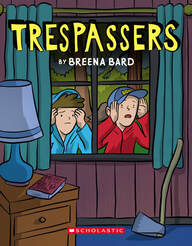 Breena Bard writes and illustrates comics, drawing inspiration from her childhood in Wisconsin, and the stacks of graphic novels on her bedside table. Her graphic novel debut, Trespassers, is set to release May 5, 2020. She lives in Portland, Oregon, with her husband, two kids, and cranky but lovable cat. Visit http://www.breenabard.com/about-1 to learn more. 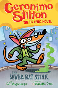 Tom Angleberger is the author of the New York Times, USA Today, and Wall Street Journal bestselling Star Wars Origami Yoda series. He is also the author-illustrator of Fake Mustache and Horton Halfpott, both Edgar Award nominees, and the Qwikpick Papers series, as well as many other books for kids. But he always wanted to draw comics and he’s finally gotten the chance to draw with Geronimo Stilton and the Sewer Rat Stink! (Available May 5, 2020) He’s married to acclaimed graphic novelist Cece Bell, who wrote and illustrated El Deafo. To learn more visit https://origamiyoda.com/the-books/ 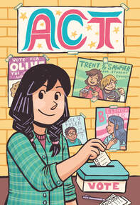 Kayla Miller is the author and illustrator of the best-selling Click series of graphic novels. The third book in the series, Act, is coming out in May 2020 and a fourth book is currently in the works. To learn more about Kayla, visit https://www.kayla-miller.com/ Terry Ebbeling has been teaching grades 7 and 8 ELA for the past eighteen years. She enjoys delving into reading and writing with her students and finds young-adult literature far more riveting than adult literature! This week's reading list:
CLICK and CAMP by Kayla Miller INVISIBLE EMMIE, POSITIVELY IZZY and JUST JAIME by Terri Libenson SMILE, SISTERS, and GUTS by Raina Telgemeier DOG MAN by Dav Pilkey ~Hosted by Amanda Smith Welcome back to 24 Carrot Writing's Graphic Novel Month. Last week our panel discussed the unique strengths of graphic novels for readers, but also, for them as creatives. If you missed Part 1, you can find it here. Lets join our panel of Graphic Novel authors for Part 2. Often those opposed to graphic novels think about these books as shallow or “comic” books, yet today’s graphic novels deal with difficult subject matter such as addiction, racism, startling historical events, and peer pressure. Why are graphic novels such an effective medium for telling these kinds of stories? Terri Libenson: I think a big part of it is because many kids love comics and/or illustrated stories; therefore, difficult subject matter won’t have to be forced on them -- they will automatically want to read about it in graphic novel form. Examples of graphic novels dealing with heavier subjects Many graphic novels have an autobiographical aspect. Why, do you think, does this format lend itself well to autobiographical storytelling? Terri Libenson: Well, all kinds of books have an autobiographical element. But I think good artists have a gift for retelling their memories in a visual way that connects immediately with readers. It can also be fun to “see” the setting and clothing of a different era rather than just read about them. Breena Bard: I’ve never thought about this before! I wonder if it’s because, just like our imaginations, our memories tend to exist in our minds largely as images. If a writer is able to put those remembered images on page as pictures, they can retain some of the vivid detail that might be lost if translated into words. There are some emotions and feelings that can be conveyed better by pictures, and when a picture won’t do, graphic novelists also have written words in their toolbox. It’s the best of both worlds, and for telling something so nuanced and complex as a personal story, I can see why writers would be drawn to a format that’s so flexible and accommodating. Raina Telgemeier's series of graphic novel memoirs. Graphic novel characters are often established fairly quickly and with few words (often one or two speech bubbles.) Please share with our readers some of your character development strategies. What happens behind the scenes, before the reader sees the character on the page for the first time? Breena Bard: For me, characters emerge when I am playing in my sketchbook. The harder I try to “design” a character, the more wooden and forced they feel. But when I let my mind and my pen wander, I am often surprised by the different characters that emerge. I try to spend a lot of time on this earlier side of character development, doodling a new character in every possible facial expression, pose and setting. And if I’m lucky enough to have two characters come to life, I can play with putting them into a variety of vignettes, or mini-scenes. Sometimes these scenes make it into my eventual script, and when they do, they are some of my favorite scenes. Kayla Miller: I think you can say a lot about a character's personality through their appearance and their actions. Every day we make choices about how to present ourselves to the world and comic artists make those decisions for their characters. Clothing, posture, facial expressions, and way of speaking do a lot of the work, but another great tool is drawing a character’s room (or other spaces they decorate and store things in, like a desk or locker). One panel of a character in their living space could be worth paragraphs of description about their personality and interests. Terri Libenson: Well, I have an advantage, as my books are hybrids: part illustrated novel and part graphic novel. The illustrated novel portion contains much more text, so I can set up a character’s story in detailed prose. The GN portion is much more of a challenge, character-wise. One technique: I frequently have characters introduce themselves. And I think dialogue or inner monologue quickly establishes their personalities. Behind the scenes, I try and get to know these characters well so that they seem convincing on paper. They usually have aspects of my personality and memories. Some are also inspired by people I’ve known – although they tend to develop differently as I write. Tom Angleberger: For me it was the matter of redrawing a famous character, Geronimo Stilton, in my own style. And, since he narrates his novels, I had to pick and choose which words of his to use in my panels. But, I’ve been a Geronimo fan for so long that all of that came very naturally. Thanks to our fabulous panel! Join us next week for the last of the panel discussion posts. We will be talking about the middle schooler's brain (ooohhh!) and gatekeepers!
A reading list for this week: CLICK and CAMP by Kayla Miller INVISIBLE EMMIE, POSITIVELY IZZY and JUST JAIME by Terri Libenson NEW KID by Jerry Craft HEY KIDDO by Jarrett Krosoczka THE FAITHFUL SPY by John Hendrix SMILE, SISTERS, and GUTS by Raina Telgemeier AWKWARD, BRAVE & CRUSH by Svetlana Chmakove (great notes on characterization and setting in back matter)  Hosted by Francine Puckly I so enjoyed meeting and chatting with Christy Ewers and Chris Tugeau, the mother and daughter team behind The CAT Agency, at the 2019 New England SCBWI Spring Conference. 24 Carrot Writing is thrilled to host this interview with Christy as Illustrator Month comes to a close. Welcome, Christy! Hello! And thank you for including me!! For a lot of authors and illustrators starting out in the children’s literature publishing world, the big question on their minds is, “What are my chances?” So what arethe chances with The CAT Agency? How many submissions do you and Chris receive each week/month/year and how many new clients do you sign? Oh boy – lots and lots. We receive a consistent flow of submissions a day. I’d say 20 on a slow day. It can be a challenge to get back to everyone, but we try to. As far as chances? We are always open to submission – always. But right now, we are not actively looking to add to our list. We are a boutique agency, so we need to be careful that we have the bandwidth to give our attention to those we currently represent before we consider taking on more talent. That said, if there is someone whose work has blown us away, we huddle about it! When there is bandwidth for more, we consider adding to the group. However, there are lots of submissions that have impressed us that we have had to pass on! That’s the one crux of being a small agency! Have you ever received a submission from an artist you’ve declined and then a year or a few years later receive a second query from the same artist who you feel has grown and developed and then decided to represent the artist? What would be the changes in the submission materials that would lead you to change your mind? Absolutely!! We have several illustrators in our agency now that have that exact story. For instance, one of our illustrators submitted to us in 2015…and after seeing her work grow stronger and stronger over the course of 3 years, I signed her in 2018. She landed a two-book deal almost immediately. I’m so grateful that she stayed in touch, evolved, grew so much as an illustrator, and had the patience that it sometimes takes! As far as changes in the submission goes, usually when we see promise in someone’s work, we will give a brief critique, things to work on, things to add, etc. and then we ask the artist to be in touch with new artwork. Obvious progress, pushing oneself, listening to critique, and being motivated to draw every day…those things are game-changers! Illustrators are encouraged to be fresh and original with their art. When you and Chris review potential clients, what are the factors that make you feel an illustrator’s voice is unique and authentic? I completely agree in encouragement for illustrators to find themselves in their style and work. We can tell if they have been heavily influenced by a certain style or trend, and it makes their work less appealing to us. That said, paying attention to what is selling and what is happening in the market is of utmost importance, too! As far as illustrators go, we really don’t recommend that they attempt to follow trends, even if their style is not one that we think would be super successful in the industry right now. Artists should stay true to themselves and create art in a way that makes them happy. We encourage practice and experimentation and growth, but only if it’s an organic process of evolving as an illustrator. I think that when people overthink being unique and authentic, it either makes them too much so— that their work becomes too niche—or it changes who they are as an artist, and it stops being fun! If you are a talented illustrator, you will find work somewhere. It may not be in picture books, but maybe it’s in scientific illustration! Maybe it’s in educational books! Maybe it’s in children’s magazines! And then maybe there’s that one picture book that’s perfect for you and only you! My point is, everyone is unique. Do YOU! What’s the most common mistake (or mistakes) an artist makes when seeking representation from The CAT Agency? Beginning an email with “Dear Sirs.” Ha! (For real.) But other than that, really it’s just treating us as you would like to be treated. Spelling our names right, reading the submission guidelines, and then being human in terms of connection and correspondence. A lot of people send out obvious group submissions, and the salutation is “Hello” and there is nothing personal in the body that gives us any idea that they care about our particular agency at all. When we respond to submissions, we do so on a personal level. Sometimes giving really thought-out critiques and guidance! When someone doesn’t give us the few minutes it takes to be a little personal, we aren’t compelled to do the same. And then everyone loses! When you sign an illustrator or author/illustrator, do you engage in a revision process with their work? If so, what does that process look like? Yes! Illustrations-wise, if there’s anything that we see that needs to be added to make their portfolio more robust and appealing to publishers, then we work with them to get it to that point. If it’s an author/illustrator working on a dummy, then I am happy to help along every step of the process. Sometimes it’s so early in the process that I help in brainstorming ideas and characters, and I’m here to help with overall story-crafting. Often, our author/illustrators either write a manuscript or sketch out a dummy before sharing it with me, and then I edit, make notes and suggestions about how to get it to the point of being submission-ready. It’s part of my job to make sure that everyone’s work—whether it be their portfolios or their dummies, or manuscripts—is as strong as it can be, and as marketable as can be when I present it. It’s also part of my job to help as our artists grow and evolve and move forward. So it’s an on-going thing; not just something that happens at the beginning of our working relationship. Of your represented clients, what do you consider to be a “good year” for The CAT Agency and your clients with respect to the number of contracted projects? And how many projects would an illustrator typically juggle at one time? Oh boy, is this a loaded question! The answer is that it’s different for everyone. We have some artists who can quadruple up on projects, and they have the speed and ability to complete dozens of projects a year. Of course, they’re not all picture books—but with a combination of picture books, chapter books, magazine work, educational work, and cover art, it’s possible. We represent some artists who only work on picture books and only work on one at a time. So a good year for them would be two picture books. We have some artists who have a very niche style or appeal, and perhaps one major project a year would be a good year for them and their particular genre. If someone is working on a graphic novel, that eats up a whole year – and so in that case, a good year is one graphic novel. When I take on clients, I ask what their goals are in children’s literature/illustration, what their ideal life/work balance would be, and what their financial needs are. And then I can set goals for myself on how I can help them to make it a “good year” for them. Of course, I’m not a wizard, and this business is still freelance – and there are no guarantees in freelance! – but together we can work to hit the mark of a GREAT year! ☺ How do you work with editors to match your illustrators to specific manuscripts? How do you determine if an illustrator is a good match for a project? Many of our projects are commissioned by editors or art directors who come to us. If our promotional efforts have worked, they’ll know about our illustrators, and they’ll come to me checking the interest and availability of an artist for a particular job. Whenever I’m visiting a publisher, showing portfolios and dummies, etc., I’ll start by asking if there’s anything in particular they are looking for. Oftentimes, they’ll say “Yes, we have just signed up a manuscript about a penguin who thinks he can fly and we are looking for an illustrator who has a fresh, painterly style, and who can create endearing, but not saccharine-sweet penguins. Got anyone who fits that bill?” And I think for a moment, and say, “As a matter of fact, I have a few!”—and we go from there. If they have interest in any of our illustrators, then it might lead to that person getting that book! Sometimes, an editor or art director will come to me, and say (for instance) “I am looking for an illustrator for such-and-such graphic novel. Any suggestions?” or “I am looking for someone who is willing to work on a tight budget, and who can turn a book around in 4 months. Got anyone?” Things like that. So, depending on the criteria, I will make suggestions—but then the art has to speak for itself from that point on! Based on your website, you and Chris represent roughly twice the number of illustrators as author/illustrators. Do editors prefer author work to be separate from illustrator work? Is it an easier sell to align an illustrator with an existing manuscript or do you find that it is a case-by-case basis? Well, when my Mom started the agency in 1994, she was one of the only strictly illustrator agencies in the business. Over time, many of her illustrators either were, or became, authors as well. When I joined, I opened us up a little more to the ‘author’ end of things, as writing is my background, and it excites me just as much as the illustrating does! As far as editors go, I think that a one-stop-shop of an author/illustrator is great, but I don’t think that it makes a huge difference. It’s not always a guarantee that they are going to love both the story and the illustrations, so there’s always that risk in submitting author/illustrated dummies. It often happens that they like the manuscript, but not the art, or the art, but not the story. Which is why just authors should generally submit only their manuscripts, and not try to assign an illustrator to their stories, or have an illustrator do artwork for them. If they like one and not the other, it may be a pass for both. Signing up just a manuscript adds that extra step in finding the right illustrator to illustrate it, but that’s the fun part! What do you feel The CAT Agency offers its clients that is unique or different in the industry? I’m not totally sure how other agencies operate, but I think that what makes us different is the family aspect of our group. My Mom and I are obviously mother/daughter, but even long before I joined her, she always cultivated an environment of “family” within the agency. She has always really cared about the people she has represented over the years; knowing and involved in their work and family life – and they were always a part of ours! Since I joined, we have expanded a bit, but it’s still really important to us to maintain the family feel. We encourage everyone we represent to get to know one another, support one other, lean on one another, and to feel like they are part of an extended family of artists. We also want to make sure that everyone feels comfortable coming to us for any reason; in the way that you would a friend. Of course, the agency is a business, and we respect that aspect of it, too. Sometimes caring for someone means parting ways, if - for whatever reason - we are unable to do our job as agents, or an artist is unable to do theirs. But even if we have to take different paths, we still support and care for everyone as they continue their journey – like a family does! When an illustrator is not working on an assignment, what do you advise your illustrators do to grow their craft/art? Draw every day! Every day. Always create and play and experiment. If you find yourself with free time, create a dummy! Or give yourself an assignment, like a mock cover, or experimenting with graphic novel illustration, or creating any number of new portfolio pieces. Try a new medium, or a new process. One thing I definitely recommend is to do a figure drawing class, or sketch from real life, or plein-air paint, or even collage. Challenging yourself or simply just practicing every day will keep you loose and creative, but you also may discover (or uncover) something spectacular in doing so. And that may just be the ticket to your next project! Christy T. Ewers is one half of the agenting team at The CAT Agency, where she represents illustrators and author/illustrators in the children’s industry, along with her mother and partner, Chris Tugeau, who founded the agency in 1994. The CAT Agency is a boutique agency that believes in the hands-on approach in representing a diverse group of talent from all over the world. Christy works closely with the entire "family" of artists, spearheading promotion and deals for CAT Agency illustrators, as well as working closely with the authors in the group to help craft their stories and hone their writing for young readers.
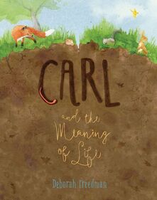 Hosted by Francine Puckly As Illustrator Month continues, 24 Carrot Writing is excited to host New England-based author/illustrator Deborah Freedman, creator of several picture books for young readers. Her books have received many starred and enthusiastic reviews, honors, and awards — including SCBWI’s Crystal Kite Award and a Parent's Choice Gold Award. Welcome, Deborah! You’re recently back from Nerd Camp in Parma, Michigan. Can you tell us a little bit about this event, how long have you been doing it, and what’s your favorite part of this outing? I love Nerd Camps! I could talk books all day if you let me, and for the past four years visiting Parma has been a highlight of my summer. It’s a place where passionate, progressive educators are sharing their most creative ideas about raising readers, in a relaxed atmosphere, perfect for spontaneous, informal conversations and getting to know people. I’ve met so many I truly respect and admire — and they give me hope for the world. I’m incredibly grateful for all teachers do. Let’s talk about CARL AND THE MEANING OF LIFE. What was the process for bringing Carl into the world, from inspiration to completion? Carl, as a character, first popped up in one of many revisions I did for my book SHY. But no one at Viking understood what this funny earthworm was doing in that book, so my darling was deleted. But not killed! Late in 2016, I was sitting at my desk, questioning my purpose in life, when this small character with big questions came back to me… and this time, he had his own story. You’ve worked with Kendra Levin at Viking Children’s Books on a few of your projects. Have you and Kendra discussed or applied any of the exercises from her book, THE HERO IS YOU? I’ve worked with Kendra on four books and have learned so much from her. We do talk about the creative process a lot, and she is as insightful about that in person as she is in HERO. The real Kendra, like the author Kendra, is a wonderful creativity therapist; when she helps steer me through some particular problem, she’s also giving me the tools and confidence to deal with it myself the next time. Tell us a little bit about the process of working with your editors. How long does it take, from start to finish, once one of your manuscripts is acquired? With Kendra, each book has started with a fairly clear concept, characters, theme… but I’m plot-challenged, so that’s where a lot of our work together happens. Even once I hope I’ve got it, she will push me to clarify my intentions and go deeper. With some projects, I chase an idea in a bunch of different directions before finding the right path, and other stories slowly evolve — but all of our manuscripts have taken a long time, up to nine months of back and forth with text and thumbnails before I start doing tight sketches. Once everything is approved for final art, Kendra hands me off to Jim Hoover, who has art directed all of my five books at Viking. With any of my publishing teams, a lot gets done by email, though of course I love those long phone conversations or occasional in-person meetings where we can really hash things out. How did you manage the leap from pre-published to successfully published with multiple books out over the last 12 years? Was there a learning curve when it came to marketing your books and crafting author visits? And did you ever feel you made any marketing mistakes or that there was anything you would avoid in future? Wouldn’t it be great if there were one place authors could go to learn everything we need to know about having a book out in the world? My main mistake has been worrying too much about what other people are doing. In the end, experience has turned out to be the best teacher, helping me to slowly trust my own instincts and simply do what I enjoy and do best—for author visits, marketing, all of it. I think that figuring out how to present our public selves to the world is a lot like finding and honing a writing voice. Which can take a while! You and I met years ago at the SCBWI Summer Conference in LA standing in line at a coffee bar, just after your debut picture book was released. You evolved from SCBWI member seeking publication to debut author/illustrator to multi-published author/illustrator who now presents at conferences. How important has the Society for Children’s Book Writers and Illustrators been to your writing career? Yes, I remember that! I’d sold my first book, Scribble, after being “discovered” at the NYSCBWI conference, and it had recently come out. Travelling to LA that year turned out to be important for my career too, because it helped me connect with my first agent. But honestly, I mostly value SCBWI for helping me find a wonderful writing community of people like you — who are supportive, inspiring, and dear to me. We never stop needing each other. When you are taking a break from working on an assignment, what do you do to grow your craft/art? A break? What’s that? ;) I should take more long breaks. But there always seem to be things on my desk, in various stages, because I’m very, very slow at developing ideas and am afraid to turn the incubator off! I have also discovered that valuable cross-fertilization seems to happen between projects when more than one is going at a time. But every day I do make time for reading from a wide range of both kid’s and adult fiction, nonfiction, essays, poetry… and my husband and I take frequent advantage of our fortunate, easy access to amazing theater, music, and museums. Other art forms give me a break from my own brain for a while and then later expand it. At 24 Carrot Writing, we pay a lot of attention to goal setting and planning. Do you set illustrating/ art goals? If so, what do they look like? I do my best to stay loose and open for as long as I can, and have figured out that I need to schedule in enough space for experimentation and play, and also time to overcome my inevitable inertia, fear, self-consciousness… My main goal is simply to grow with every book; I just want to feel like I’m always pushing forward. My biggest dream is that someday the final product will be as good as what was in my head. :) Deborah’s most recent releases are CARL AND THE MEANING OF LIFE released by Viking Children’s Books on April 2, 2019, as well as SHY (Viking Children’s Books, 2016) and THIS HOUSE, ONCE (Atheneum Books for Young Readers, 2017). To find out more about Deborah, visit her at https://www.deborahfreedman.net, @DeborahFreedman on Twitter, and @freedmanillustrates on Instagram.
UPDATE: Our copy right agreement with Candlewick Press for the use of Tania's spectacular artwork has expired. Even though we had to pull the lovely drawings, Tania's content is still applicable and her book is a must for every elementary school classroom. Please browse her portfolio at taniaderegil.com/, buy A NEW HOME and preorder SOMETHING ABOUT GRANDMA, launching August 2022 here.  ~ Guest post by illustrator Tania de Regil My name is Tania. I’m from Mexico and I’m the author of A NEW HOME (UN NUEVO HOGAR in the Spanish edition)(2019; Candlewick Press), which shows the story of a boy moving from New York to Mexico City and, at the same time, a girl moving from Mexico City to New York. In a combined voice they share their fears about leaving their home, but because we see their story side by side, we realize how they are more alike than different and that home can be found wherever life leads. This story is very personal and it was inspired by a series of things that happened to me while growing up. When I was 5 years old, just around the same age as the boy and the girl from A NEW HOME, my mom and dad had some big news for my brother and me. My dad had been accepted to a prestigious medical school in Stockholm, Sweden! This, of course, meant we had to move. Truthfully, I was scared, I had never even heard about this place before, and I didn’t fully understand what moving really implied. All I knew was that I would be leaving everyone and everything I loved behind, and that I was going to miss my home very much. Nevertheless, we left soon after that, but something happened that I wasn’t expecting at all. I loved it! I quickly fell in love with Sweden, with the people, the food, and everything about it really, and in no time, I felt right at home. I had the opportunity to experience incredible new things that wouldn't have happened if I’d never moved to a different country. We lived there for three years and then we moved back to Mexico City, but I still cherish those years I called Sweden my home. When I graduated from high school, I really wanted to study art or design. I knew I wanted to have that experience of living in a different country again, so I applied to different schools across the United States. And this time, I got accepted to an incredible design school in New York City! I was thrilled! When I arrived, I fell in love with the city: its sparkling energy, its incredibly diverse people, and how there was something new to discover every single day. From these experiences of moving around, I realized that no matter where I found myself, I could make that place my home. I learned so much from living in different countries and I am so grateful for that. It really opened my eyes and helped me realize that I should always be willing to try new things, no matter how scary they might seem at first. With this idea, I started writing A NEW HOME. Now, a funny thing happens when we move to a different country: our experience living abroad actually connects us on a very deep and emotional level to our home country. Things you’ve taken for granted before suddenly become so precious, and you start seeing them with a different mindset. While living in NYC, I started reminiscing all the things I loved about my home city. The sounds, the smells, the food, and the people. All these things that make up a city, and what actually makes each place so wonderfully unique. There were so many things about Mexico that I wanted to share. And to tell you the truth, NYC reminded me of Mexico City in so many ways. So, you could say that this book is a love letter dedicated to these two magnificent cities I’ve had the honor of calling home and an effort to help others see them for what they truly are. On a final note, another incredible thing I was able to experience while living in different countries was meeting people from all over the world. While I was living in Sweden I went to an international school, so I had friends from Kenya, England, Australia, Iran, Israel, Poland, Finland, India, USA, you name it. It was amazing! I was able to learn so much from all my friends. And since NYC is one of the most diverse cities in the world, I met amazing people there as well. Because of this, I learned that that no matter where any of us come from, we’re really not that different. So, even though the boy and the girl from A NEW HOME grew up in completely different cultures and circumstances, they are experiencing the same fears and emotions—which serves to show that in the end, we are all just humans. Bio:
Tania studied fashion design at Parsons School of Design in New York City and finished her studies in her home country of Mexico. Her work as a costume designer in film and television has helped to better grasp the art of storytelling through images. She uses a variety of media in her work, such as watercolor, gouache, color pencils, wax pastels and ink to create richly textured, engaging images. Visit Tania's website: https://taniaderegil.com/ Tania’s American debut picture books , A New Home, and Un Nuevo Hogar, are available from the following vendors: Indiebound: https://www.indiebound.org/book/9781536201932 Barnes&Noble: https://www.barnesandnoble.com/w/a-new-home-tania-de-regil/1129102613?ean=9781536201932 https://www.barnesandnoble.com/w/un-nuevo-hogar-tania-de-regil/1129102661?ean=9781536206753 Amazon: https://www.amazon.com/New-Home-Tania-Regil/dp/1536201936/ref=sr_1_1?keywords=A+new+Home+Tania+de+regil&qid=1565288619&s=books&sr=1-1 https://www.amazon.com/nuevo-hogar-Spanish-Tania-Regil/dp/153620675X/ref=sr_1_2?keywords=A+new+Home+Tania+de+regil&qid=1565288619&s=books&sr=1-2  Guest blog by Ileana Soon Hello! My name is Ileana, and I am the illustrator behind Annie Cronin Romano's book, Night Train: A Journey From Dusk to Dawn. I was invited by 24 Carrot Writing to contribute some of my thoughts and share my experience bringing Night Train to life. There were a lot of things I learnt along the way. I'll touch on my process here as well as walk you through some of my thoughts behind my visual decisions. This will be fun! Getting the manuscript, thoughts and ideas I was really excited when I got the manuscript as I had felt like the story was right up my alley. It had travel, a train journey, and a great sense of adventure. Whilst reading the script, the feelings it evoked popped a few visual references into my mind, such as the movie A River Runs Through It (directed by Robert Redford) as it seemed to capture the same feeling. Seeing as it was a period setting, other visual references soon followed that were also period pieces; movies like Testament of Youth (directed by James Kent) and The Painted Veil (directed by John Curran). Below are some screenshots taken from the movies mentioned. As an illustrator, I think it is important to always bring something personal to every project worked on, the theory being that sharing a personal experience through art will somehow invite an emotional connection from the viewer, even if it's something that can't quite be explained. I find that throughout my life I have been attracted to paintings only to find that it, too, was very personal to the artist. Reading Annie's script brought back a lot of my memories travelling as a student throughout Europe and the UK. To save on accommodations, there were many nights spent at train stations and on trains, enroute to the next destination. It was the perfect experience to borrow from as I remember some nights staring out the window from my train, and watching the sun rise as the train moved into a new station and country the following morning. It was exhilarating. Below are some pictures taken during my travels that served as reference. To begin, it was important to lay out the pacing of the text. What would be the rhythm of this book? Using Photoshop, the words were cut and pasted onto each page until the pacing felt right. Next, I wanted to come up with a visual vocabulary for this world. As you may now realise, cinema is something I really love, and borrowing from this, the art direction for this world could be set in screen direction, and colour. Visually, it's a challenging task to illustrate a train making a journey through the night. If you think about it, how many truly different ways are there to paint a night sky? How many night skies can there be in a book without boring the reader? (Surely not 32 pages!) To vary and make it visually interesting, I wanted to bring variation to this journey through colour temperature as you can see in the swatches below. I will also touch more on colour later. Screen direction (or page direction in this case) seemed important to show continuity in the train's journey from dusk to dawn. It's vocabulary that some films use to show progress for a character throughout a plot. It's a subtle thing, but throughout the book the train always moves from the left of the page to the right. Every single page. Included below is this thought laid out in a page sent to the publisher. Let's draw! So to recap, here is a summation for the visual vocabulary of Night Train. Inspired by the aforementioned films, the story was set in the 1920/30s. Inspired by my travels in Europe and the UK and a train journey that I took from a big city to a small town by the sea in the UK, I thought mapping a similar route would help to capture the same sense of wonder in these illustrations I felt on that journey. The colours would change from warm in the beginning to cool by the end. The screen direction for the train would always move from left to right. Annie also shared her thoughts of how it would be great to set the train journey in the Pacific Northwest. Great! More specificity — always a good thing. Ideations, thumbnails, sketches and revisions Since pacing is very important, it was important for me to ideate the entire book in one go, instead of focusing on a page at a time. This meant jotting (drawing) ideas out on posits whilst laying out the entire book. This is all done by hand, sticking post-its to a wall. This was a habit my director and I used to do, whilst previously working at an agency as a lead designer, doing different storybeats for commercials and laying it all out in sequence on a glass window. Below are the rough notes ideating for Night Train in sequence. Please forgive the roughness of this; this is not something I would ever show to anyone and it's done for my reference only when beginning a project. They are just thoughts. Doing this provides an opportunity to see the story as a whole and choose compositions that work sequentially to match the pacing in relation to each other, rather than picking the best composition for every page, which would make the book tonally flat (imagine a loud note for every page — not fun to listen to surely). I sometimes imagine sequential images as a song: the notes (images) have to flow together nicely, the volume (light vs dark) has to modulate as well, and all in one key! That's where visual vocabulary comes in. From these thoughts, images are chosen to put together thumbnails to deliver to the publisher: After the thumbnails are delivered, the team at Page Street gave me a green light to move toward sketches. Sketches are refined drawings from the thumbnails presented. From these sketches, my Artistic Directors give feedback, and these sketches go back to the drawing board until they are approved. The team at Page Street had the fine idea of introducing a family as characters that we could follow throughout the book, instead of the separate individuals I had previously sketched out. Great idea! Some sketches are approved straight away, but some go through several iterations. Included herein is a sample of the evolution of a sketch from presentation to approval: Colour Script After all the sketches were approved, I was asked to bring a spread to finish, and somehow in the back and forth with the team at Page Street, I proposed the idea of doing a colour script so they could see at a glance how to book would look like as a whole. Included herein is the colour script that was sent to Page Street: Challenges with colour One of the great challenges of this project was to find a way to have words sit on a page against the night sky whilst still being legible. Blue, or black for that matter, is dark in value, and black words against a dark blue sky is very hard to read. The publisher specified at some point that most of the type printed would be black, so on my end I felt it was important to structure the pages so that the words could be read against the painted backgrounds. Additionally, there was also the extra challenge as previously mentioned to make the pages more exciting, as 32 pages of purely dark blue skies would make the book tonally flat. Thus, if you notice, less than 50% of the book (about 41%) is actually set against a dark blue sky, whilst the rest is set against the backdrop of the sun setting, and the sun rising, which gives a lot of opportunity for the black type to sit against lighter backgrounds, making it more legible. This opportunity also opened up a pocket of time in terms of the hours that the train started and ended its journey. If its journey started at say 5pm, and ended at say 7am, the different variations of light that it would see during its journey would naturally vary a lot, bringing with it many exciting ways to introduce changes in colour temperatures as the pages turned. Sticking to the visual vocabulary of moving generally from a warm palette to a cool palette from beginning to end, the frames have been aligned in sequence here so it may be easier to see what my thought process was like in doing this colour script. Race to the finish After the colour script was approved, everything from there on out was very straightforward. It was really a matter of just refining the pages from the colour scripts to a bigger final, finessing the final details, and adjusting colours as needed. Since it was set in a very specific time period, and also in a very specific geographic region, it really is important to make sure that all the references were right, from the costumes to the shapes of trees and smaller details surrounding all the pages. Below are some costume references sourced from that time period. These references were sourced from books at the library, archived film footage, as well as Pinterest. The final few weeks working on this really did feel like a race to the finish! Below is an example of the evolution of a page from the colour script to the final. The End Delivering the pages to my AD was a great feeling, and she has to be thanked for really being there at every step of this journey with me. I sincerely believe that all the feedback given made the pages better, and the visual ideas stronger. Hopefully, this translates over to the reader when they pick up this book. Final thoughts
Thank you for letting me share my process of bringing Night Train to life with you, and thank you to 24 Carrot Writing for inviting me to do so. I hope it was helpful and am looking forward to reading all the different approaches/processes other illustrators have here in the future. About the Illustrator Ileana Soon is an illustrator/vis dev artist who grew up in a small seaside town in Borneo, before making her way to Los Angeles where she currently lives and works. Her clients include The Wall Street Journal, The New York Times and Oprah Magazine. She has also won multiple awards, including a Silver Medal from 3x3, as well as recognition from American Illustration and The World Illustration Awards. Learn more about Ileana and see more of her work at http://ileanasoon.com/, on Instagram at https://www.instagram.com/ileanadraws/, and on Behance at https://www.behance.net/ileanasoon. |
Peruse blogs for advice and tips from KidLit creatives.
Categories
All
Archives
April 2024
Click to set custom HTML
Click on the RSS Feed button above to receive notifications of new posts on this blog.
|
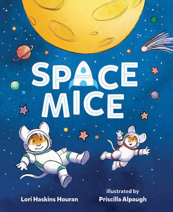
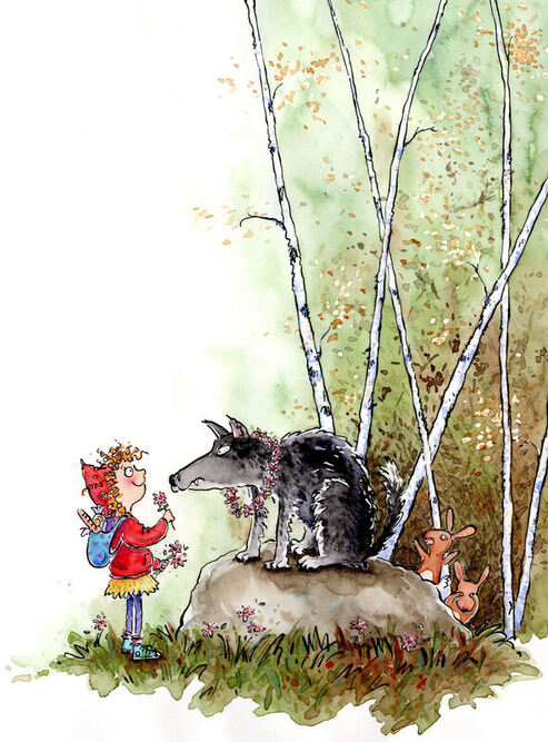
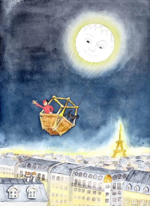
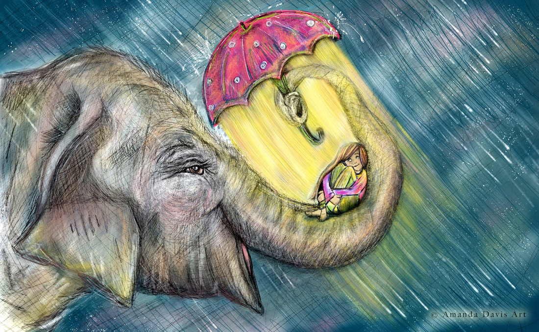
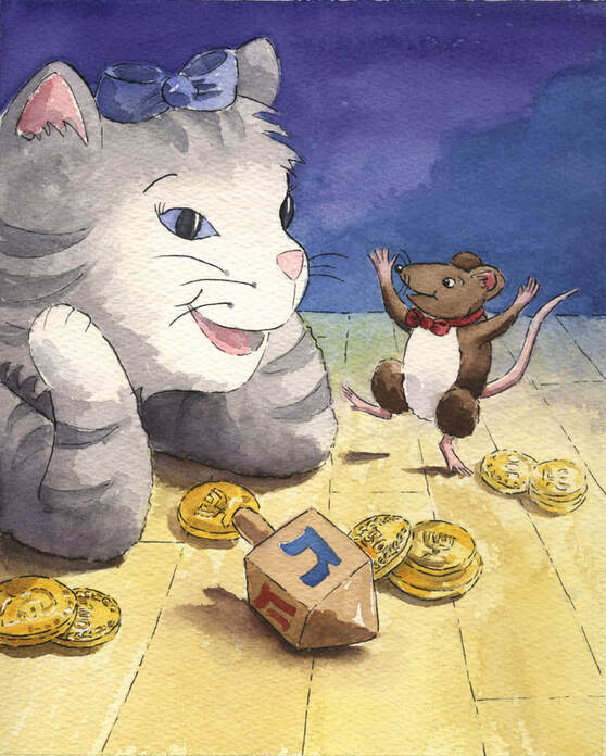
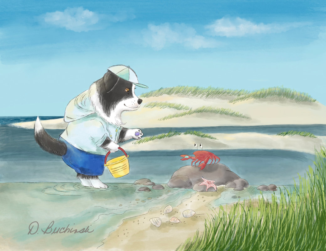
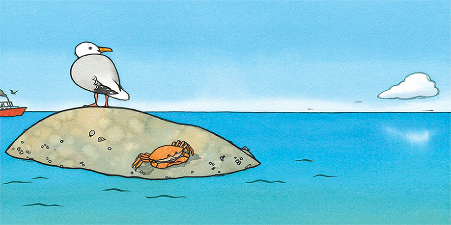
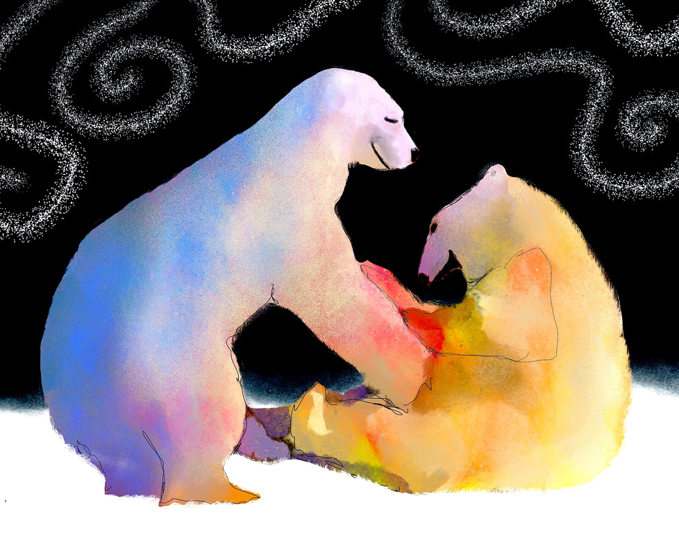
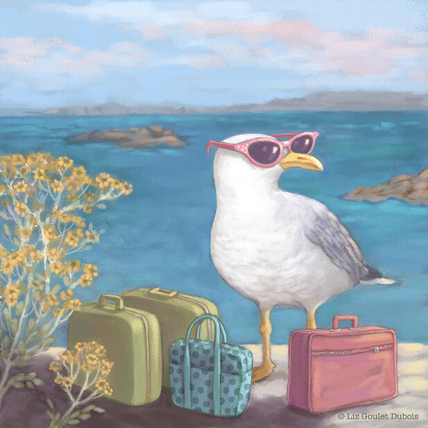
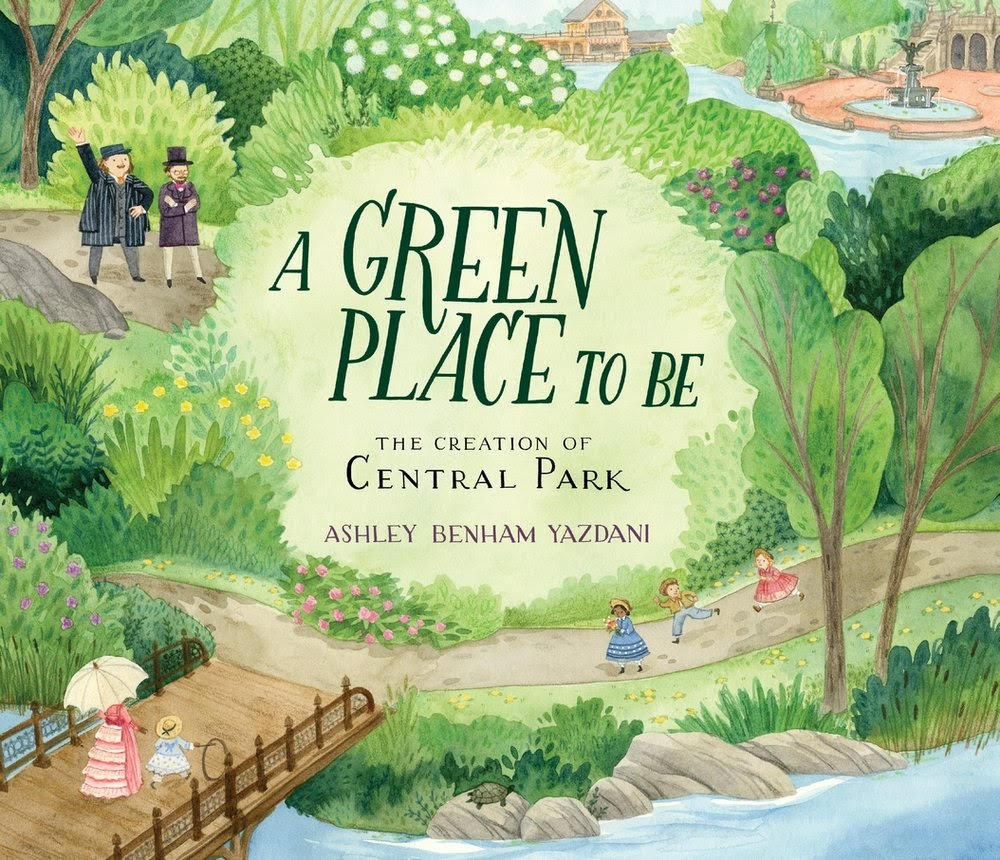
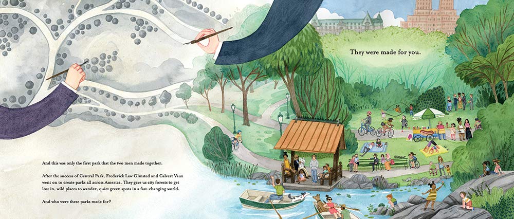
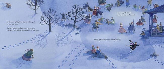
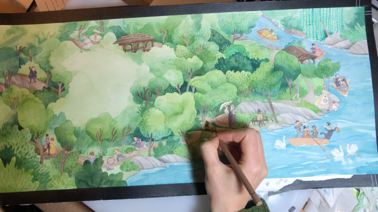

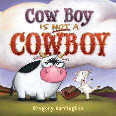

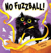


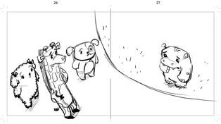
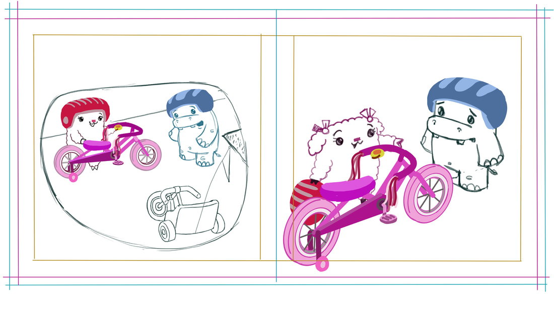
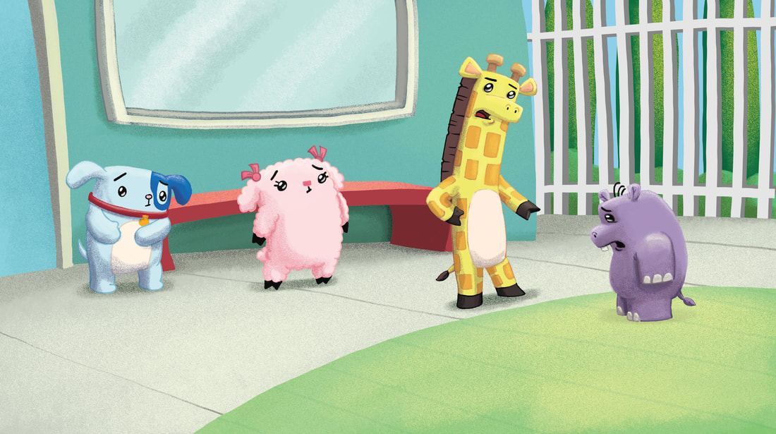
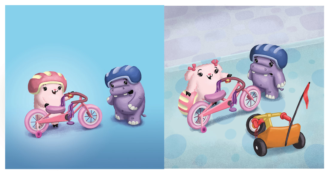

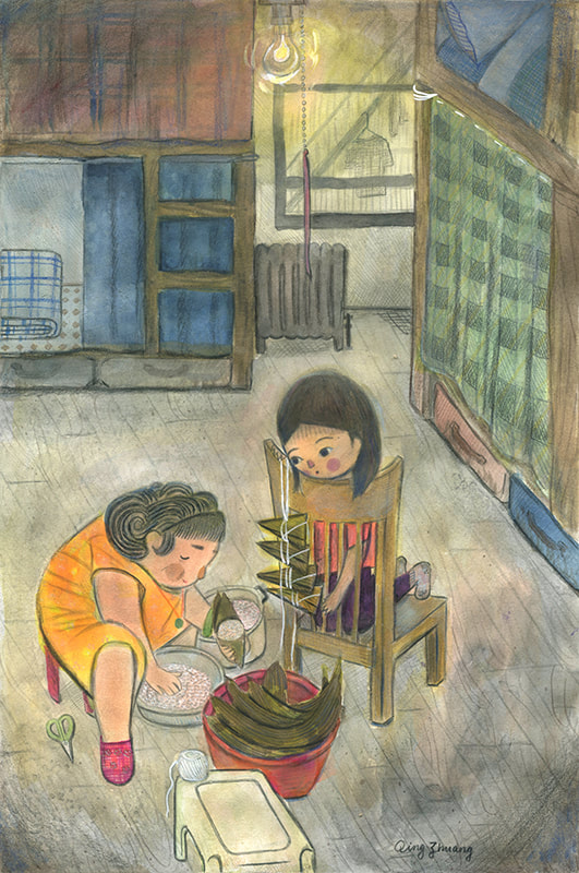

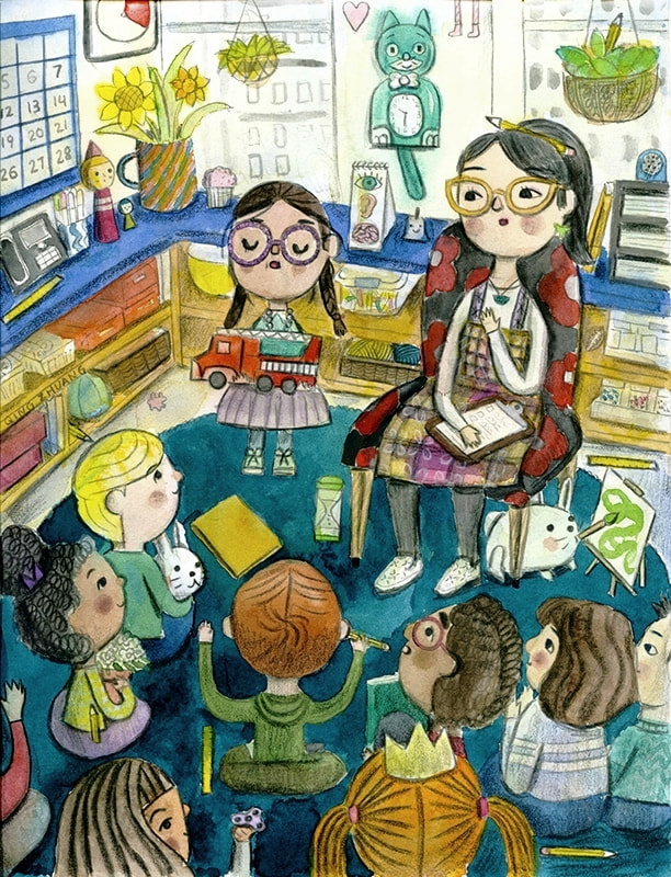
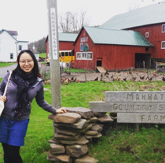
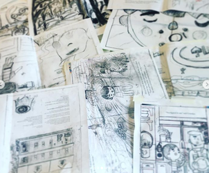
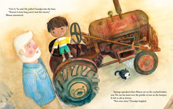
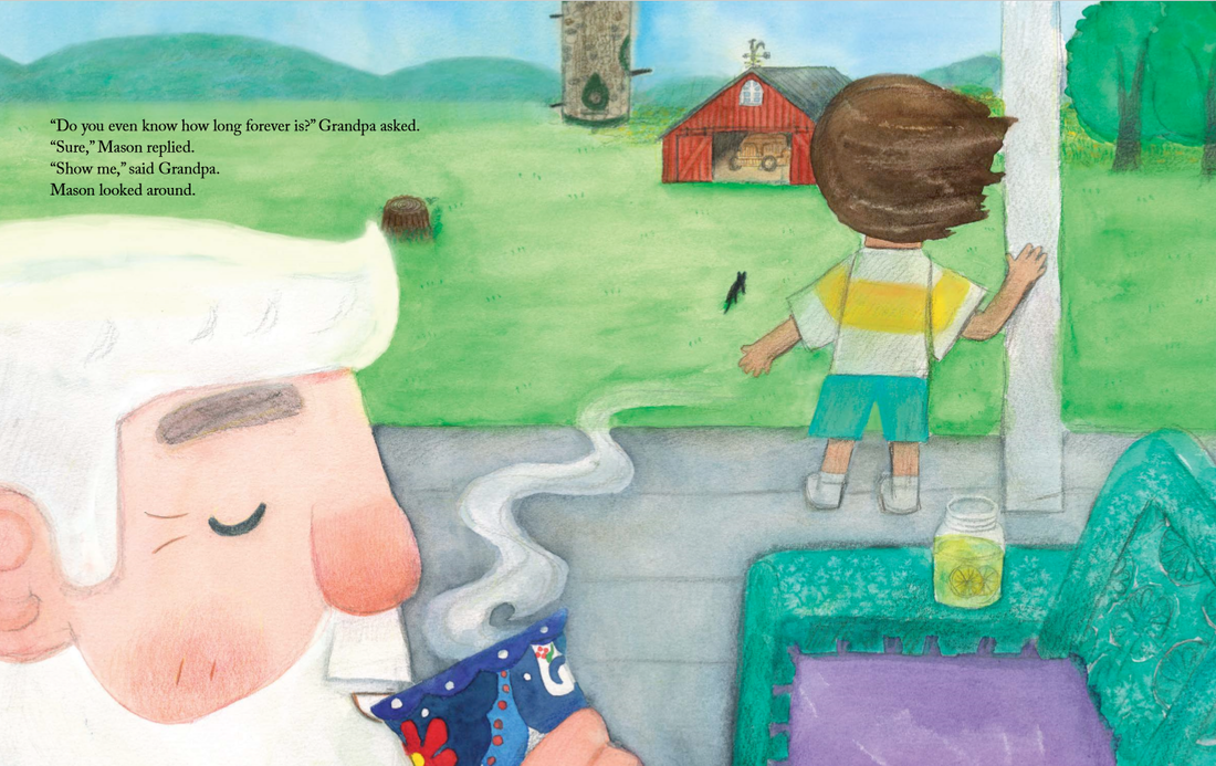
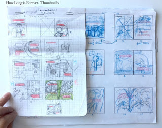
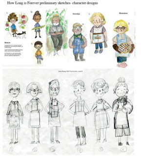


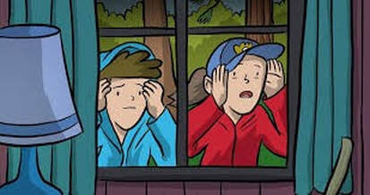
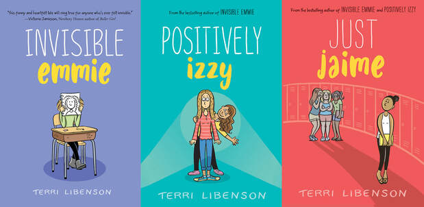
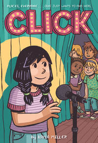
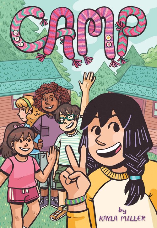


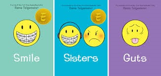
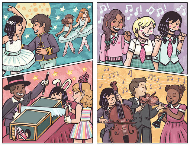
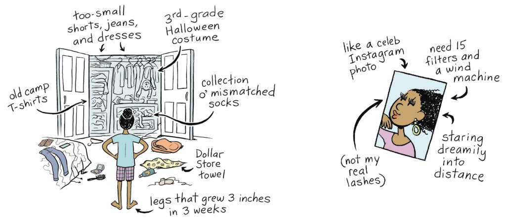
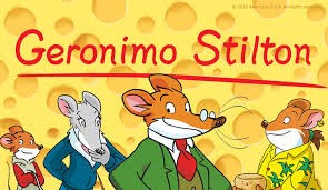

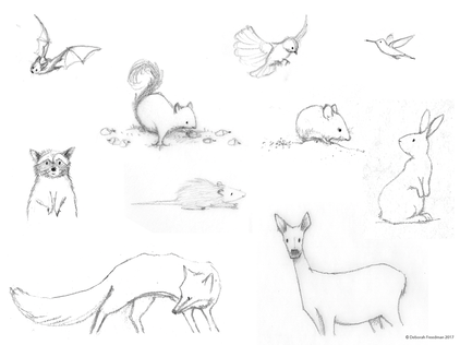
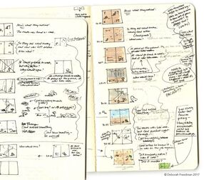
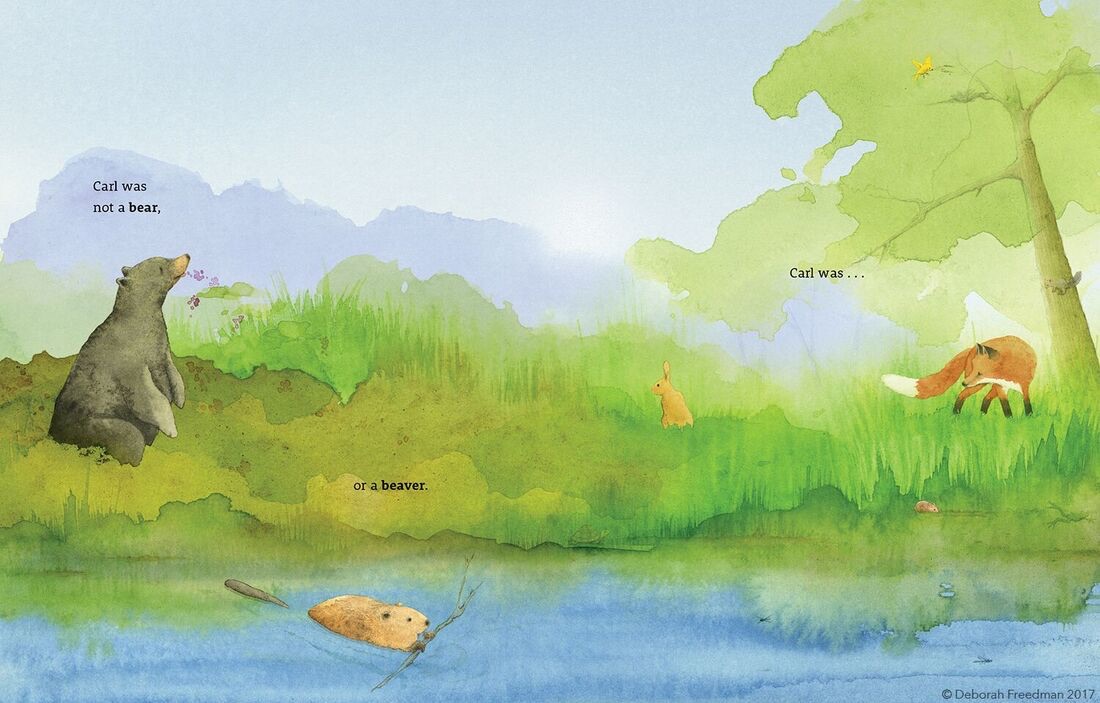
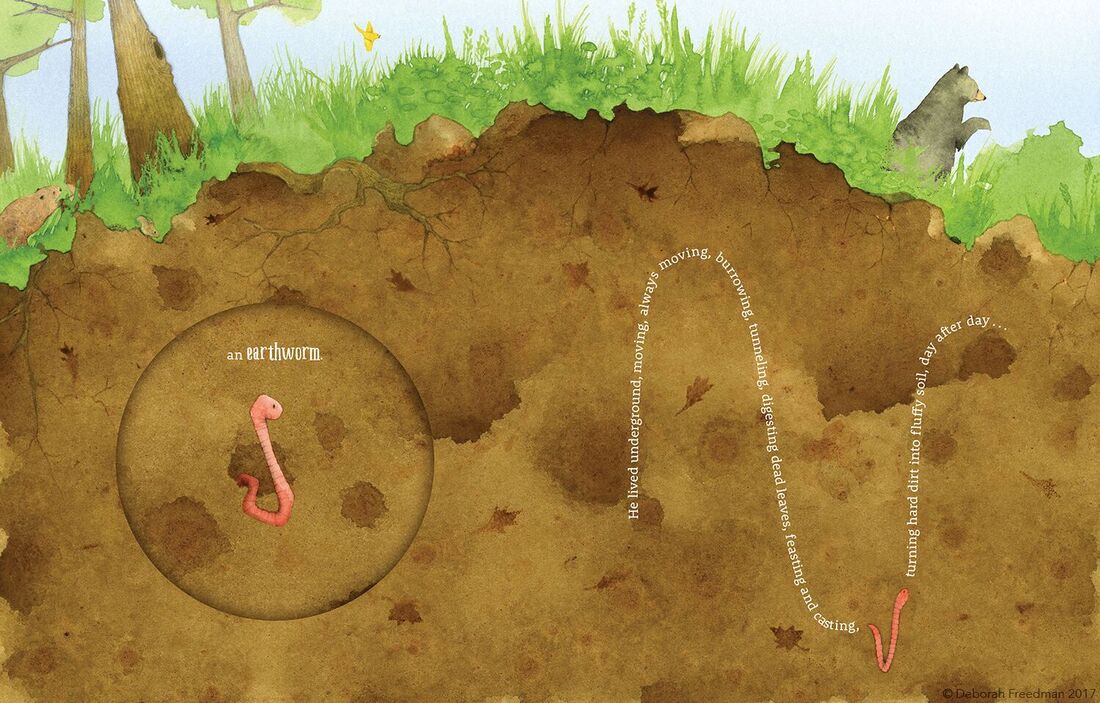
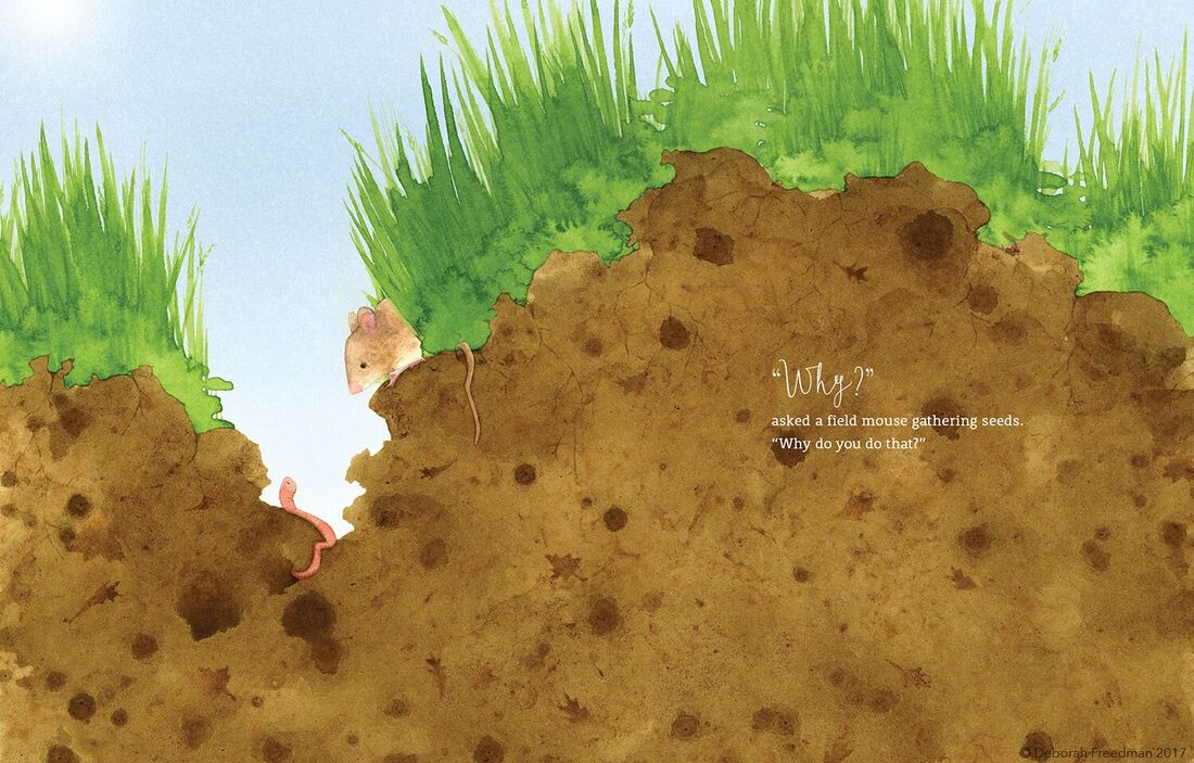

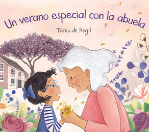
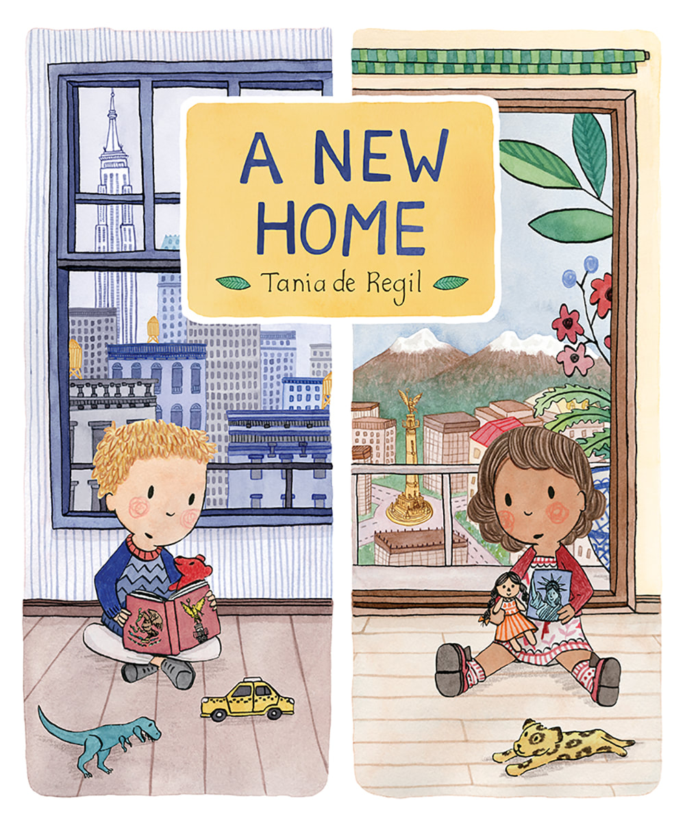
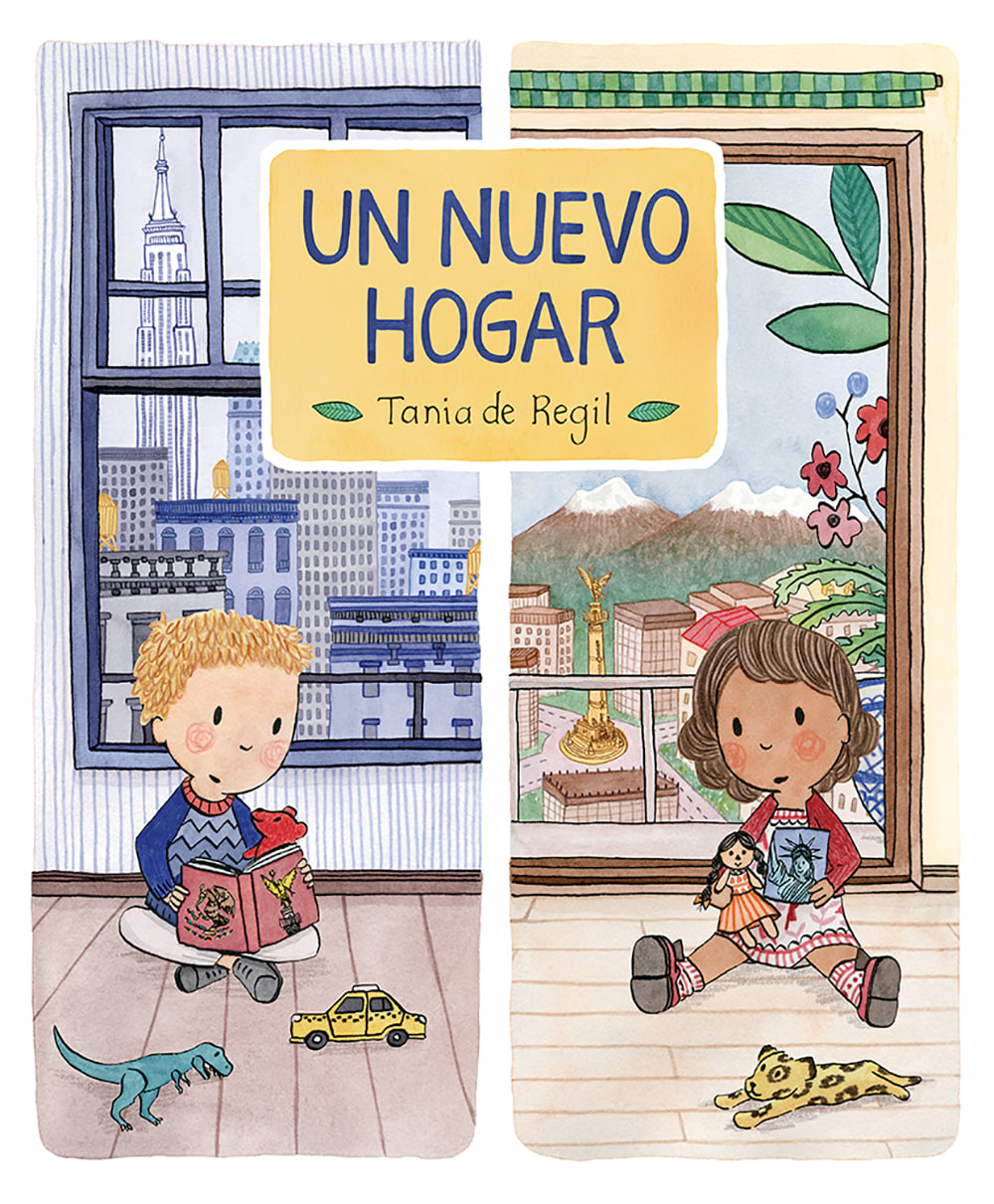
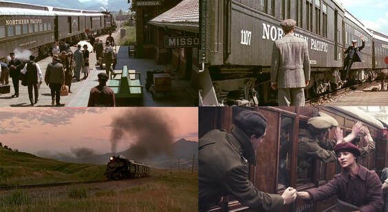

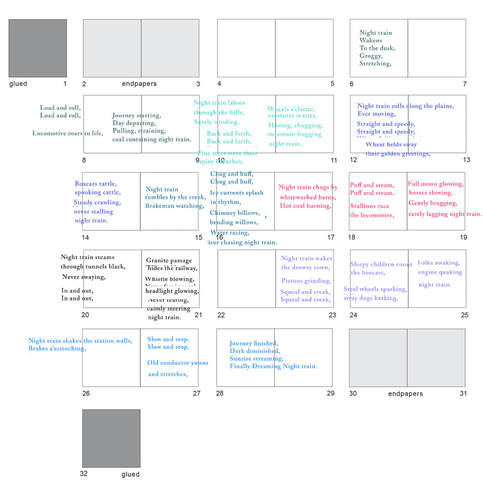


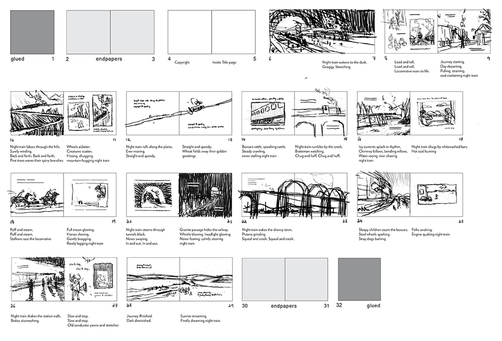
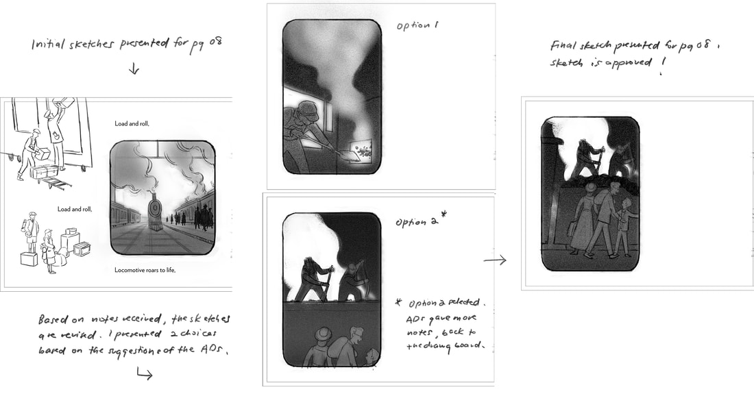


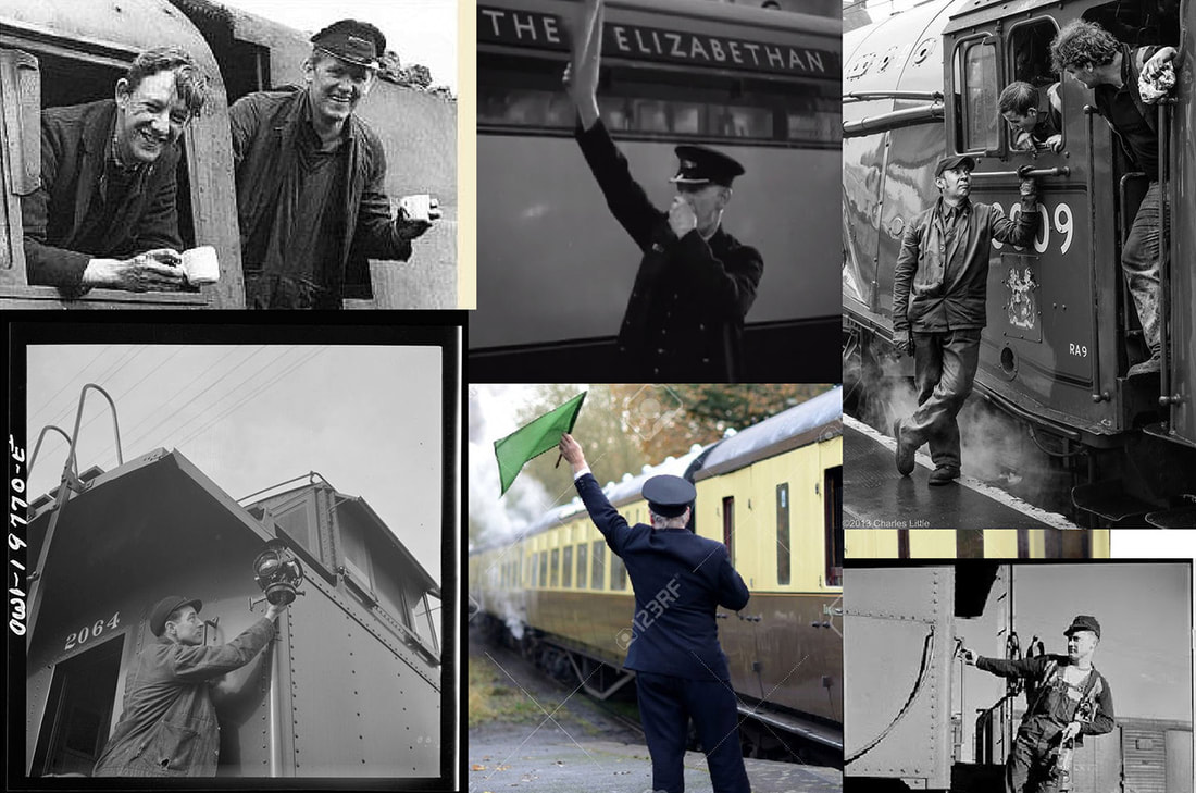
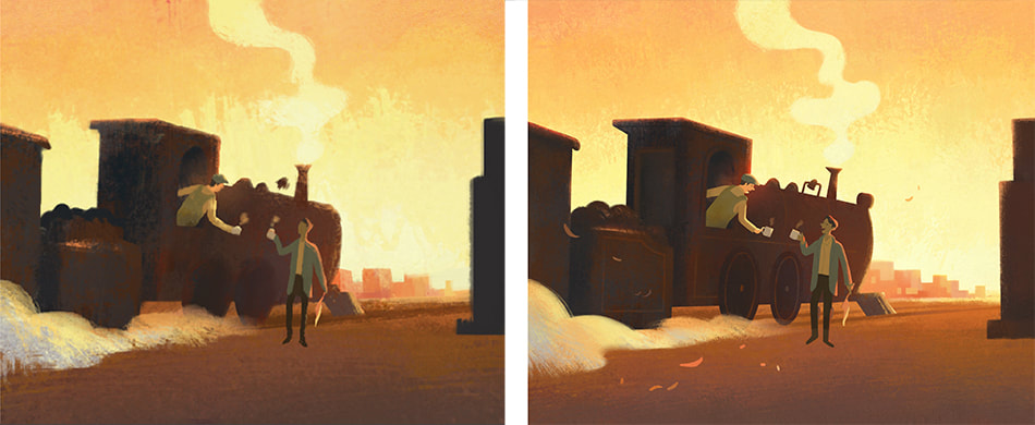
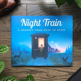
 RSS Feed